Thayer Course Planner
Enabling graduate students to intuitively and efficiently map out their courses.
Jan-Mar 2024 | DALI Lab (Product & UX Designer)
Team
Skills
Deliverables
Timeline
We designed a course planning tool for graduate students at Dartmouth's Thayer School of Engineering.
BACKGROUND
This was a DALI Lab project for our client, Dartmouth Information, Technology and Consulting (ITC). I collaborated with two other co-designers to interview students, iterate wireframes, and conduct usability testing. We worked in an Agile team, prioritizing features based on technical feasibility and MVP timelines.
PROBLEM
The current course planning system is repetitive and decentralized, which confuses and frustrates incoming students.
Dartmouth ITC identified a need for a more visually intuitive, straightforward platform for Thayer graduate students to plan each academic year, approaching us to refresh the existing site and minimize unnecessary steps for future cohorts.
We discovered that the current platform lacks built-in resources, like course descriptions or a course planning tutorial. Students spent additional time joining instructional calls and researching courses in separate tabs from another site. They also had to physically print and submit their plan after completing it online.
OPPORTUNITY
How might we help Thayer students streamline their course planning process so they can make confident and efficient decisions?
SOLUTION


A comprehensive platform that intuitively guides users to create a personalized course plan.

Clear, Accessible Instructions
A collapsible dropdown of steps shows new students how to use the platform. Another dropdown yields a carousel scroll of key course requirements and resources, helping the user identify courses individually relevant to their degree.
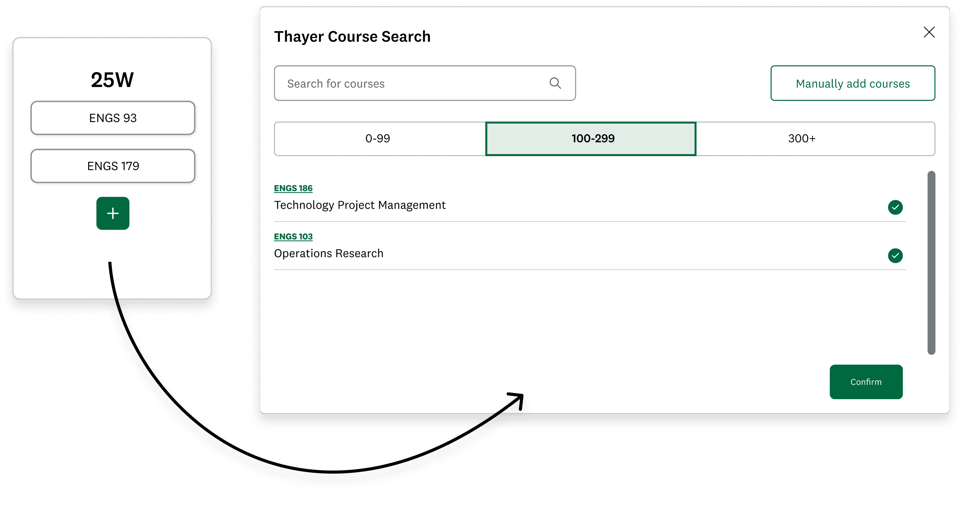
Course Search Overlay
Rather than researching courses from an external website and manually entering course codes, users browse a built-in catalog and instantly add multiple courses at once for each academic term.

Track Degree Requirements
While selecting courses, users tag which degree requirement each course satisfies. Requirement details are then displayed in a progress tracker on the main page. This flow enables users to visualize how their course choices fulfill their degree, and flag their missing requirements.
Wondering how we arrived at this solution?
Explore our design journey below!
PROCESS

RESEARCH
Reviewing Current System
Dartmouth ITC wanted us to simplify how students input personal information and intended courses, while tailoring the planner and help text to each of the six graduate programs. To start, we examined each program’s existing course planning platform and clarified flow steps with our client.

We thought the current course planning process was redundant and inefficient, and made a note to ask users what they thought about course selection and scheduling flows in our interviews.
RESEARCH
User Interviews
“Too many tabs open, too tedious. I dread course planning.”
Before revamping the existing UI, we needed to decide whether to adjust or replace the existing two-step course plan flow:
Users manually enter course codes for their desired classes.
Users re-enter course codes into a quarterly schedule.
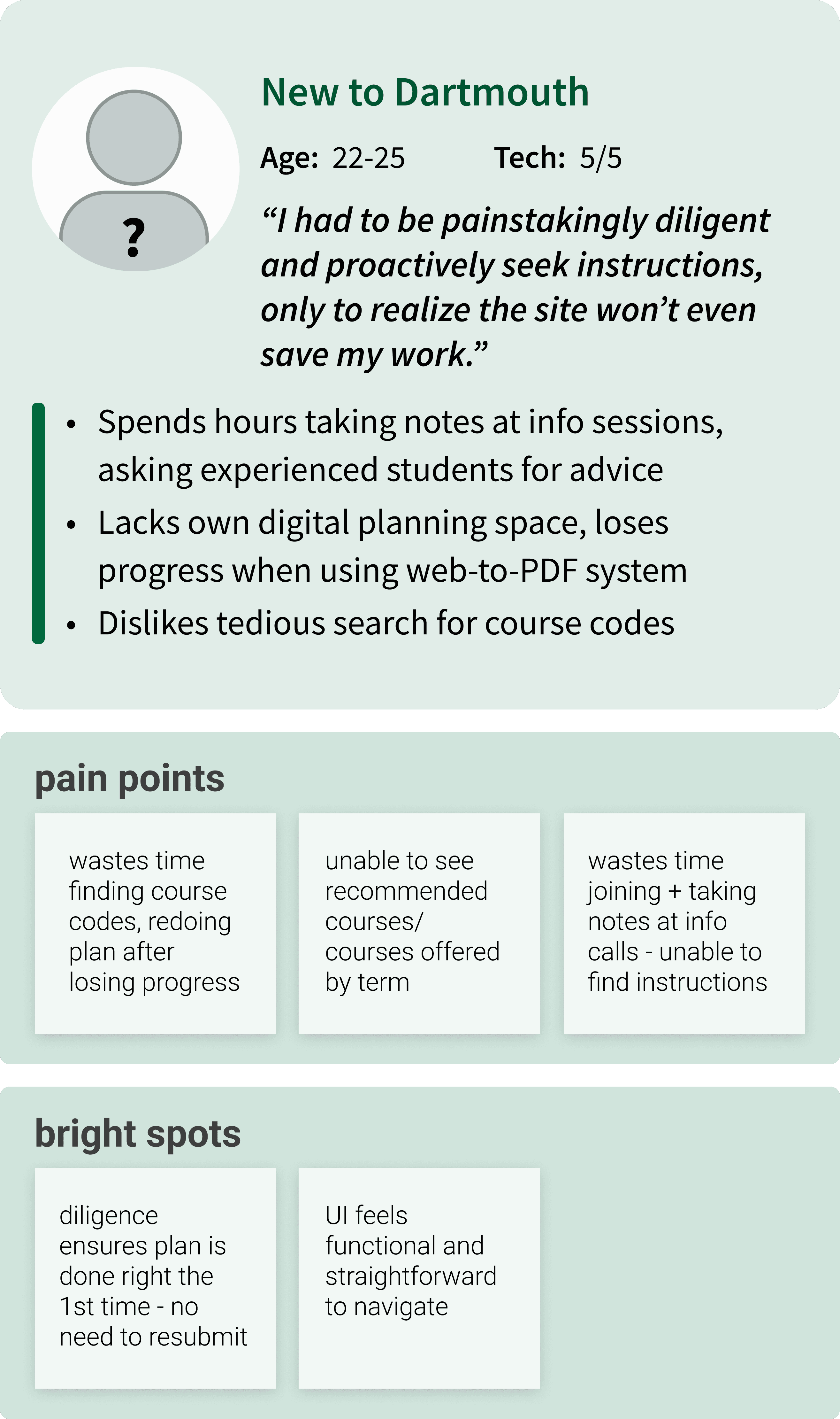
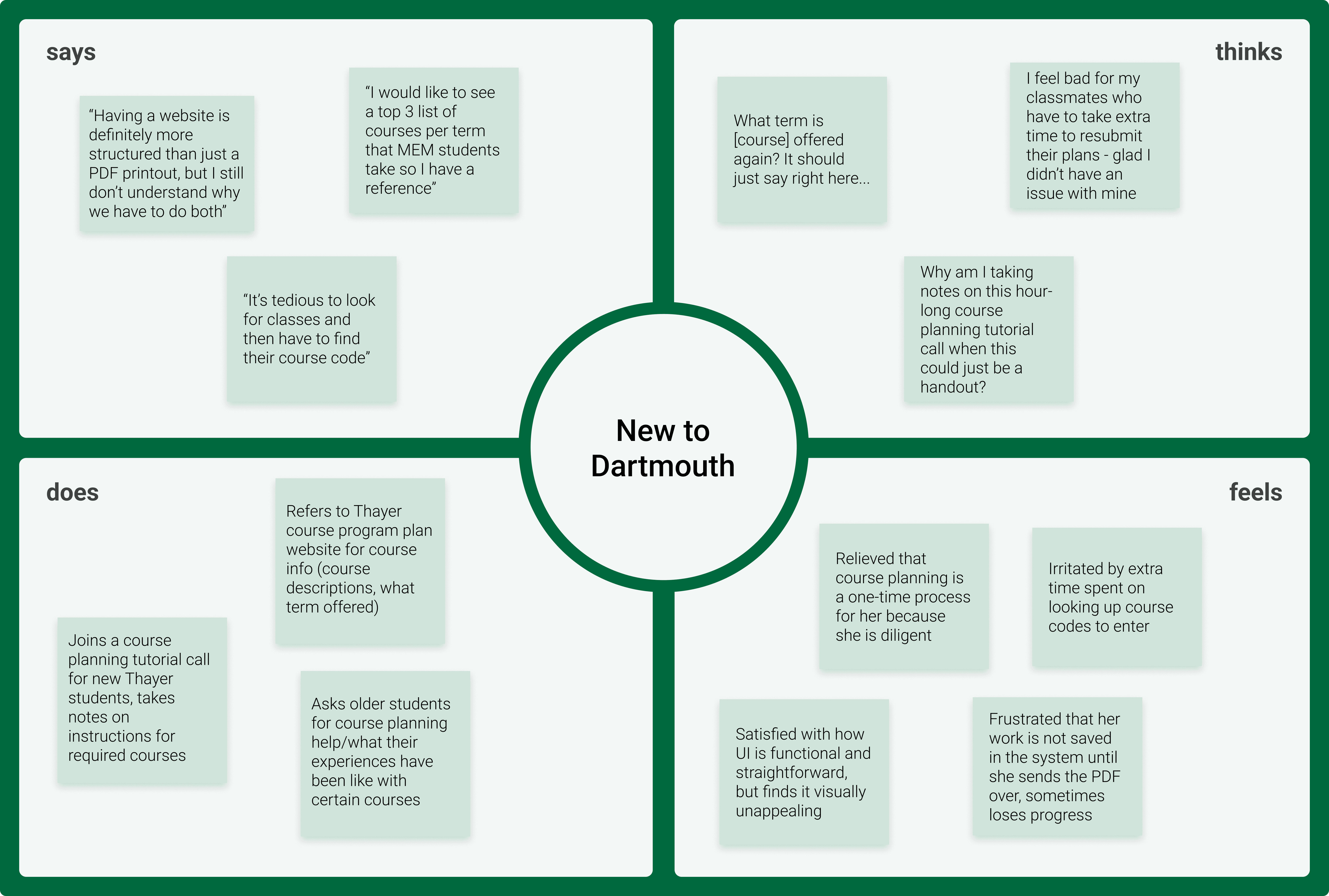
To more closely understand how students approach course planning, we conducted in-depth interviews with multiple users in each Thayer graduate program who either completed their bachelor’s programs from:


?

By asking students with varied undergraduate backgrounds to walk us through their current planning process, we aimed to collect a wide sweep of critical limitations and associated user pain points from Thayer’s existing platform.
Key User Interview Questions
Explain your entire course planning journey from start to end.
What information is most helpful for finding your intended courses?
Is there anything you find challenging or annoying about the course planning process? Why is it challenging? Where in the process do you experience difficulty?
What could make the course planning process a better experience for you?
Is your course plan something set in stone or are you able to change it? If you can change your course plan, what is this process like?
RESEARCH
Empathy Maps, User Journeys
From our user interviews, we crafted empathy maps and user personas for our two main undergraduate backgrounds. This process helped us more closely comprehend and empathize with our target audience’s perspectives.


DEFINE
Needs, Pain Points
We distilled our user research findings into critical course planning pain points, which mainly stem from a lack of built-in tools and resources on the current platform.
Help text is dense and unclear

Finding, adding and submitting courses is inefficient
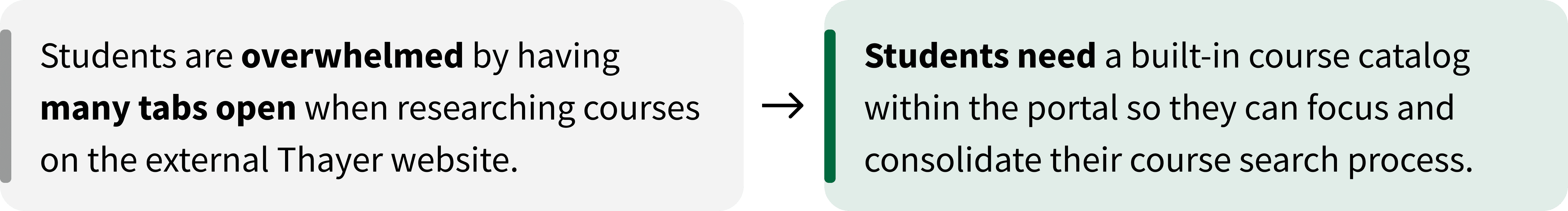

No error checking

DEFINE
HMW
Statement
How might we help Thayer students streamline their course planning process so they can make confident and efficient decisions?
IDEATE
Goals
Simple

Accessible

Reliable

IDEATE
Brainstorm
With our product goals in mind, we rapidly ideated then downselected potential design solutions into a feature brainstorm.


IDEATE
Flow Sketches
After clarifying priorities and deciding main flow steps with our client, we mapped our remaining solutions into an initial list of flow features while brainstorming more potential features along the way. We concurrently drew a first pass at flow sketches to visualize our various feature ideas.


Since we were operating in a tight 10-week sprint, we consulted with our team’s developers to determine functionality constraints to design within. After consolidating our flow sketches, we collectively starred core features that we thought most effectively met user needs and were confirmed to be technically feasible.
IDEATE
MVP Features
We then worked with our project manager on a comprehensive feature specification document, harnessing user insights within functionality limitations to distinguish our reach goals and out-of-scope ideas from our MVP features.


MVP-Focused Flow Sketches
Our feature prioritization process enabled us to refine and structure a user flow sketch that emphasized our MVP elements. This sketch was the basis for our initial Figma designs.

PROTOTYPE & TEST
Lo-Fi Wireframes
Breaking Down Complex Instructions
A major design specification was to ensure the help text was digestible and clear for users to feel more comfortable referring to it, instead of seeking scattered information from other sources. Our lo-fi wireframes enabled us to quickly experiment with visually organizing degree-specific guidelines in an appealing, straightforward manner.
We initially envisioned a toggle dropdown of full instructions (Version 1), so users could access all help text from the homepage and hide it from view when ready.
But after our first DALI design critique of the term and consulting with our client, we decided to prioritize a less cluttered approach: breaking down instructions into a toggle carousel scroll of cards with dot indicators (Version 2). Later, we added relevant hyperlinks to access supplementary course information if needed.

Version 2 saves more vertical space and helps users stay aware of their progress without being overwhelmed by a dense wall of text.
Organizing Course Catalog Navigation
When I first wireframed the course catalog overlay where users search for and add courses, the developers informed me that filtering courses by term was infeasible.
I still wanted to avoid presenting users with an overwhelming list and began exploring alternative ways to organize the catalog. My focus shifted toward categorizing courses by core and elective requirement, ensuring users could browse and select courses relevant to their needs without the burden of endless scrolling.
I presented two main iterations at our first design critique and to users.

Option A was more confusing as users did not intuitively understand that the Core and Elective buttons were filters, and initially thought the prerequisite tags were selectable.
Users preferred Option B because filters were clearly defined, collapsible course dropdowns enabled more efficient scrolling, and prerequisite text along with a link to more information did not visually compete with the primary “add class” CTA. These distinctions collectively reduced decision paralysis.
Tracking Degree Progress
We decided to scrap the process of entering courses by requirement and then re-entering by academic term, but first wanted to test alternative ways to track user progress. We prepared two main iterations for our design critique.
A co-designer wireframed a requirement checklist that retained the original process, minus the double manual entry. As users entered course codes into the term display, the same courses would populate in the requirements checklist.
In my iteration, I wireframed progress bars to visualize how courses met requirements. I also moved the academic term display to the top so users would understand to add courses first.

Users thought Option B was easier to follow as it placed the requirements tracker below the term display, with progress bars as clear visual indicators. However, they thought having multiple progress bars was redundant and took up too much visual space. Users also wanted Option A's more structured checklist to track planning progress.
In response to this feedback, we began brainstorming ways to combine the progress bar's intuitive visual appeal with the straightforward checklist format to fulfill user preferences.
PROTOTYPE & TEST
Visual Design System
We based our visual design system off the preexisting Dartmouth style guide, reserving our red accent color for error messages.


PROTOTYPE & TEST
Hi-Fidelity Prototype
Let's help users feel confident about seamlessly planning their courses
A second DALI design critique along with user feedback helped us refine our wireframes into high-fidelity mockups. Our UI decisions distilled early iterations into a more intuitive, streamlined course planning flow that both met our project's technical constraints and addressed important edge cases.
Simplifying and Personalizing Course Search Overlay
Through continued user research, we found that graduate course schedules were far from cut and dry. Across five Thayer programs, each student has a unique course combination that meets various overlapping requirements within core and elective categories.
Adjusting to this flexibility, we restructured the catalog's core and elective filters to be organized by numerical course level. We also added a pill selection of program-specific requirements, guiding users to assign each course to a requirement before adding it to their schedule.
The developers also realized they could only find course codes and titles in their available data. With this update, we had to remove course descriptions and prerequisites from our hi-fidelity mockups and instead embed links from the external website in each course title.
Brainstorming through this limitation yielded a new idea to replace our course dropdown chevrons with quick-select buttons, reinforcing the course addition path to be more actionable for users.
Combining Requirements Checklist With Progress Bar
We merged our checklist and progress bar designs into a collapsible module that gives users real-time feedback on how each course choice contributes to their degree. This appears both visually with an overall progress bar, and textually by populating course choices under corresponding requirements the user selected in the course search overlay.
Once users have entered courses that satisfy every degree requirement, the "Download PDF" button switches from disabled to default state. When clicked, a PDF view of the user's final plan appears with further submission instructions, which completes the course planning flow.
Enabling Manual Entry for Courses Outside Catalog
Some interdisciplinary elective courses are outside the engineering department catalog, creating an edge case where students must manually add these courses to their plan.
I designed the manual add overlay. When iterating on how to present degree requirement options, I instinctively chose radio buttons as an effective signal for users to select a single requirement for each course. This feature deviated from the pill selection in the main course overlay. As a team, we decided to compare how users responded to each UI control in our first round of usability testing.
PROTOTYPE & TEST
Usability Testing
We conducted in-person usability tests with 4 Thayer graduate students and other student users from DALI. Guided by our findings, we refined our prototype with the following changes:
Reformatting How Degree Requirements Are Displayed
Users who were new to Thayer found the pill selection of degree requirements misleading and frustrating when they attempted to choose multiple requirements for each course.

Our usability testing yielded unanimous preference for radio buttons. Radio buttons clearly indicated how each course is assigned a single requirement, which was especially helpful for first-year graduate students.
Clarifying Edit and Delete Flow

Over half of our users found the hover menu for course choices clunky and spatially confusing, frequently causing them to delete the wrong course. However, they universally understood the icons, eliminating the need for labels. We redesigned the hover state to display edit and delete icons directly on each course, making it clear to users which course they were modifying or dropping.
We initially designed a standalone edit overlay for course changes, but users preferred having full catalog context while editing. So in our final iterations, we updated the edit flow to return users to their work in the original course overlay.
Enabling User to Add Multiple Courses at Once
Some of our users disliked needing to reopen the course search overlay every time they added a new course, and suggested a multi-select format to speed up the process.
Due to prioritizing other features towards the end of our sprint, we just designed an early iteration of the multi-select idea and hope to make this feature more intuitive in future designs. Some potential directions include expanding the catalog overlay to make a dedicated section for selected courses, and creating a secondary CTA that prompts the user to search for another course.
REFLECT
Next Steps, Takeaways
This project was challenging but fulfilling: in 10 weeks we completed an end-to-end website redesign, working closely with our developers and PM to align the product with user preferences and technical constraints. We transformed the Thayer course planning portal into a clear, intuitive tool that enables graduate students of any experience level to confidently organize their courses.
Here are 3 key takeaways we learned from this sprint.

Our Dartmouth ITC clients were enthusiastic about our final product and look forward to deploying the revamped site in the fall of 2025. We plan to implement feedback from more extensive usability testing to further streamline the course planning process. Potential future steps include obtaining the course data necessary to include full course descriptions and filter courses by when they are offered.
