Thayer Course Planner
Enabling graduate students to intuitively and efficiently map out their courses.
Jan-Mar 2024 | DALI Lab (Product & UX Designer)
Team
Skills
Deliverables
Timeline
We redesigned a course planning tool for graduate students at Dartmouth's Thayer School of Engineering.
BACKGROUND
This was a DALI Lab project for Dartmouth Information, Technology and Consulting (ITC). Our team of 3 designers revamped the online Thayer course planning portal by interviewing graduate students, translating their insights into wireframes, and validating designs with usability testing. Working closely with our developers and project manager, we balanced user needs with technical feasibility to prioritize and deliver features on MVP timelines.
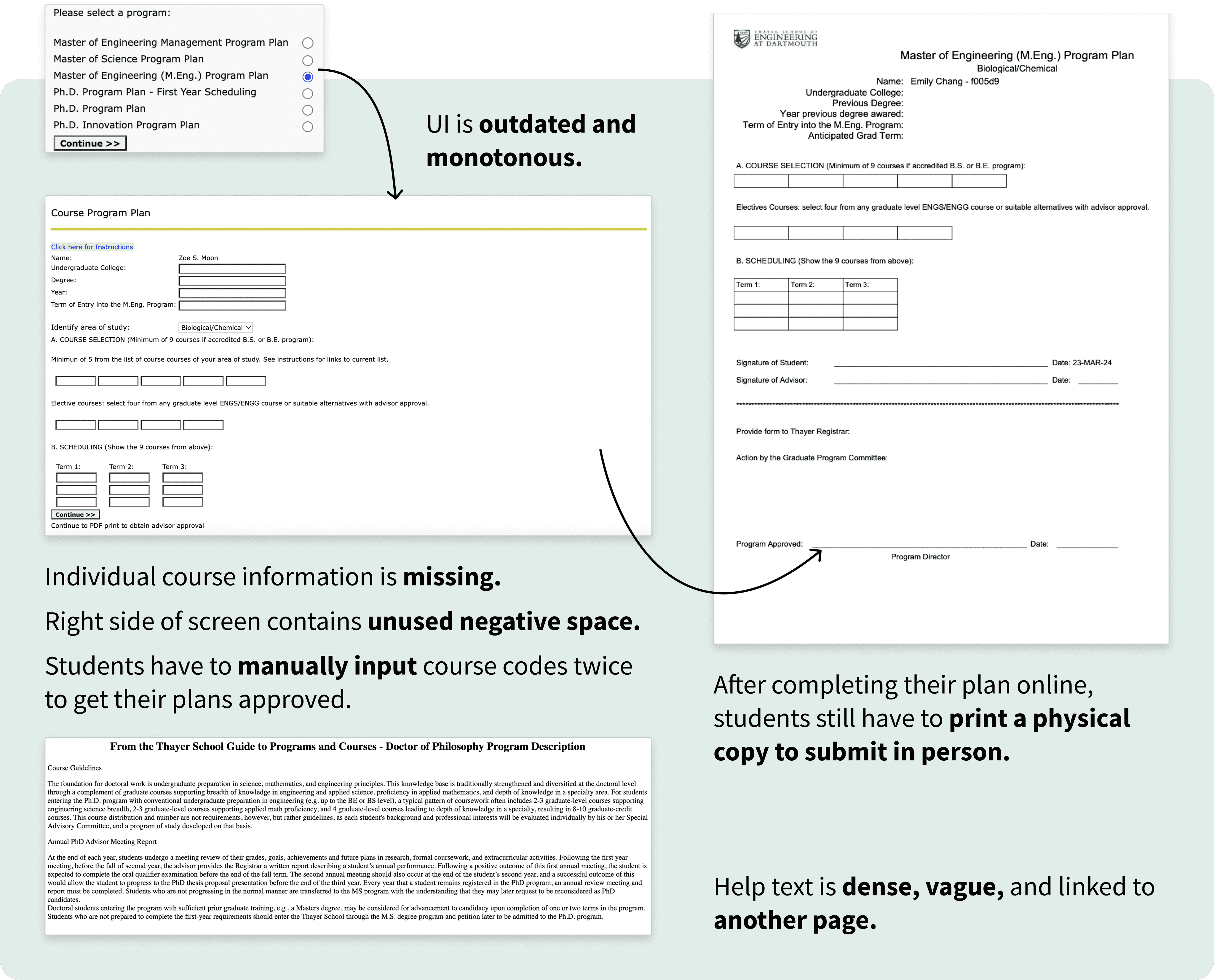
PROBLEM
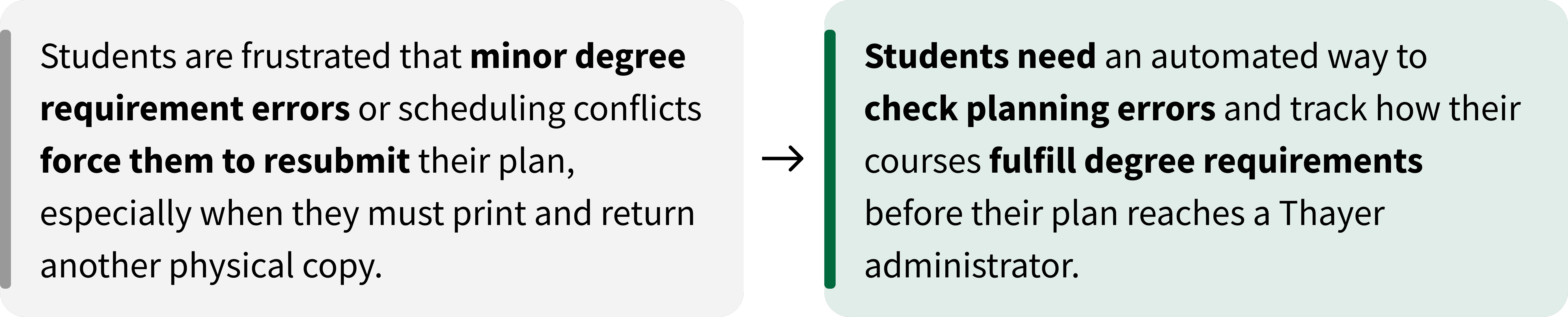
The course planning system is repetitive and decentralized, which confuses and frustrates incoming students.
Dartmouth ITC tasked us with refreshing the Thayer course planning portal to eliminate unnecessary steps in academic year planning for future cohorts of Thayer graduate students.
OPPORTUNITY
How might we help Thayer students streamline course planning so they can make confident, efficient decisions?
SOLUTION
A comprehensive platform that intuitively guides users to create a personalized course plan.
PROCESS
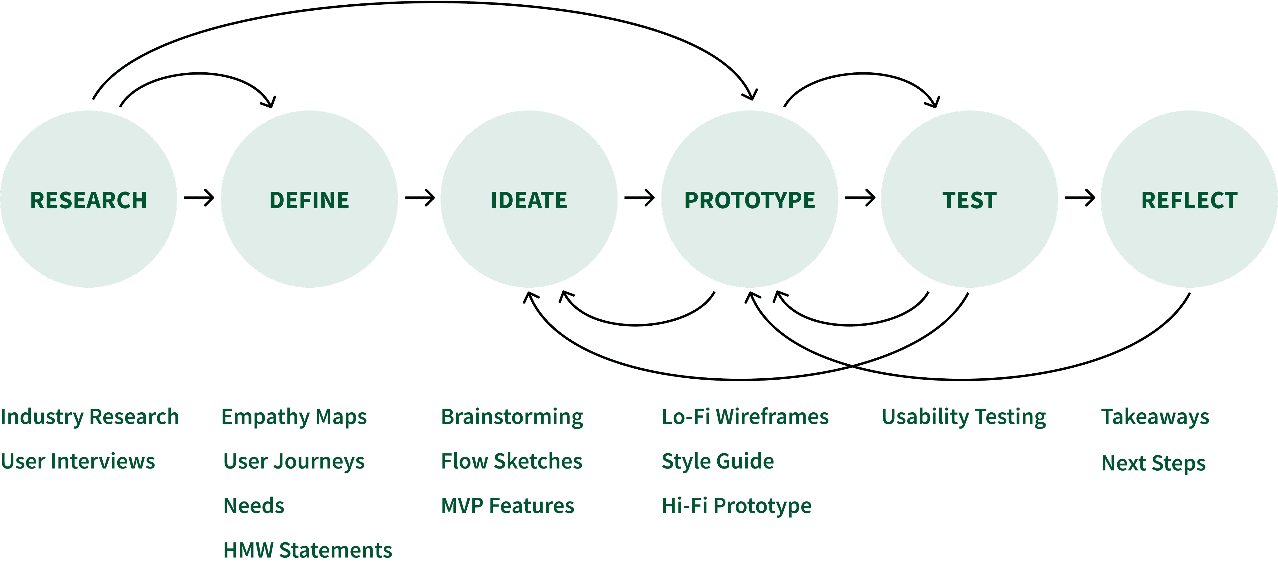
RESEARCH
Reviewing Current System
Identifying several redundancies throughout the flow, we flagged course selection and scheduling as key pain points to investigate in user interviews.
RESEARCH
User Interviews
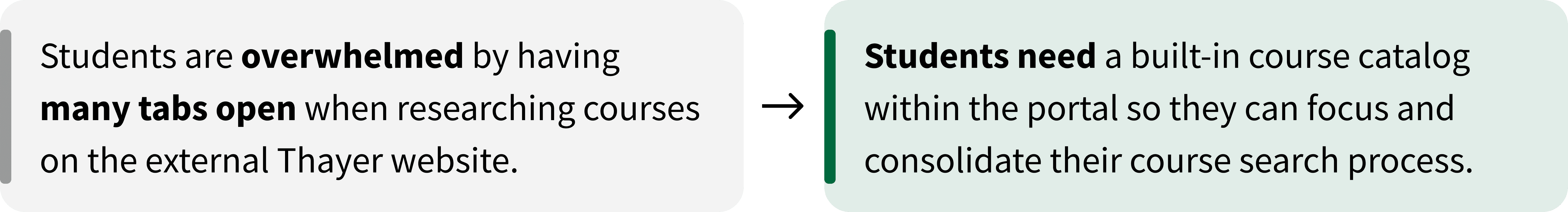
“Too many tabs open, too tedious. I dread course planning.”
Before reworking the UI, we first had to assess whether to refine or replace the existing two-step flow:
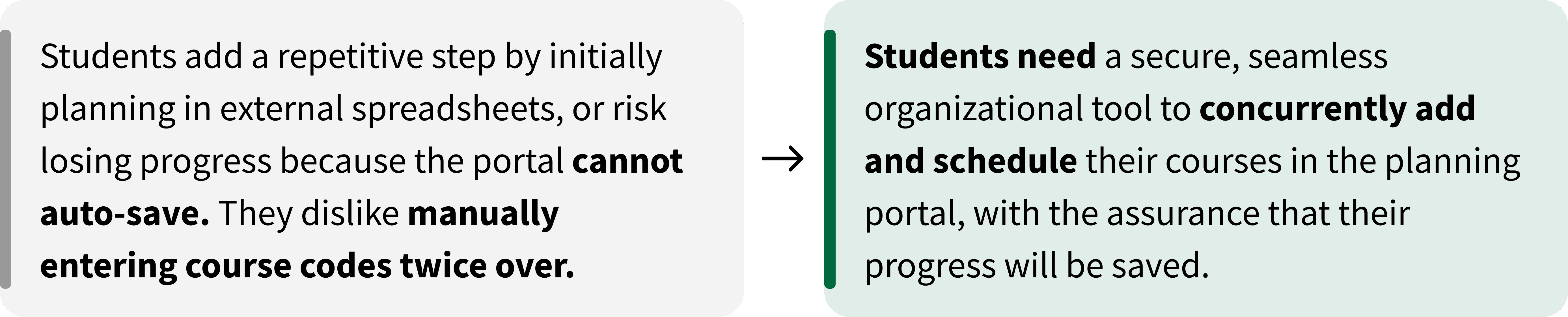
Students manually enter course codes for desired classes.
Students re-enter the same codes into a quarterly schedule.
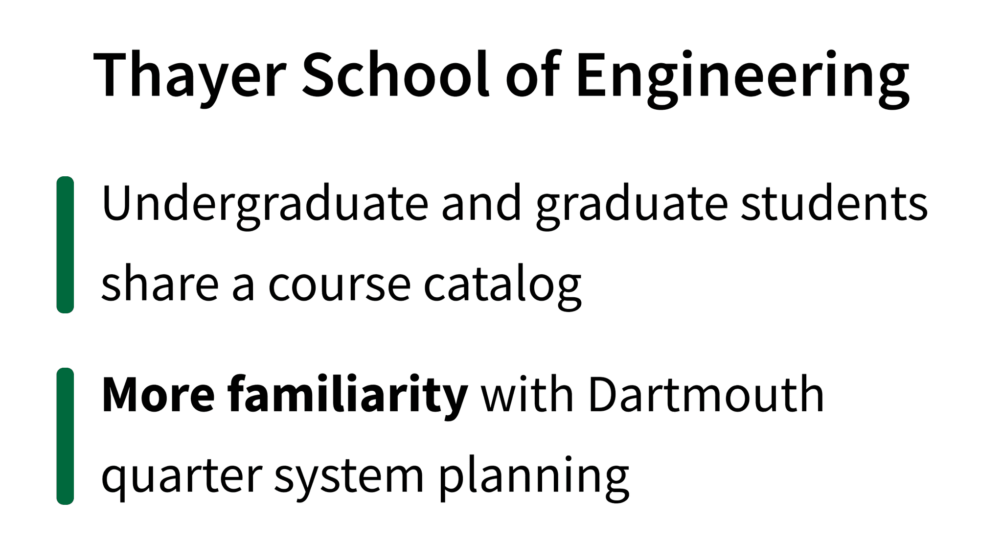
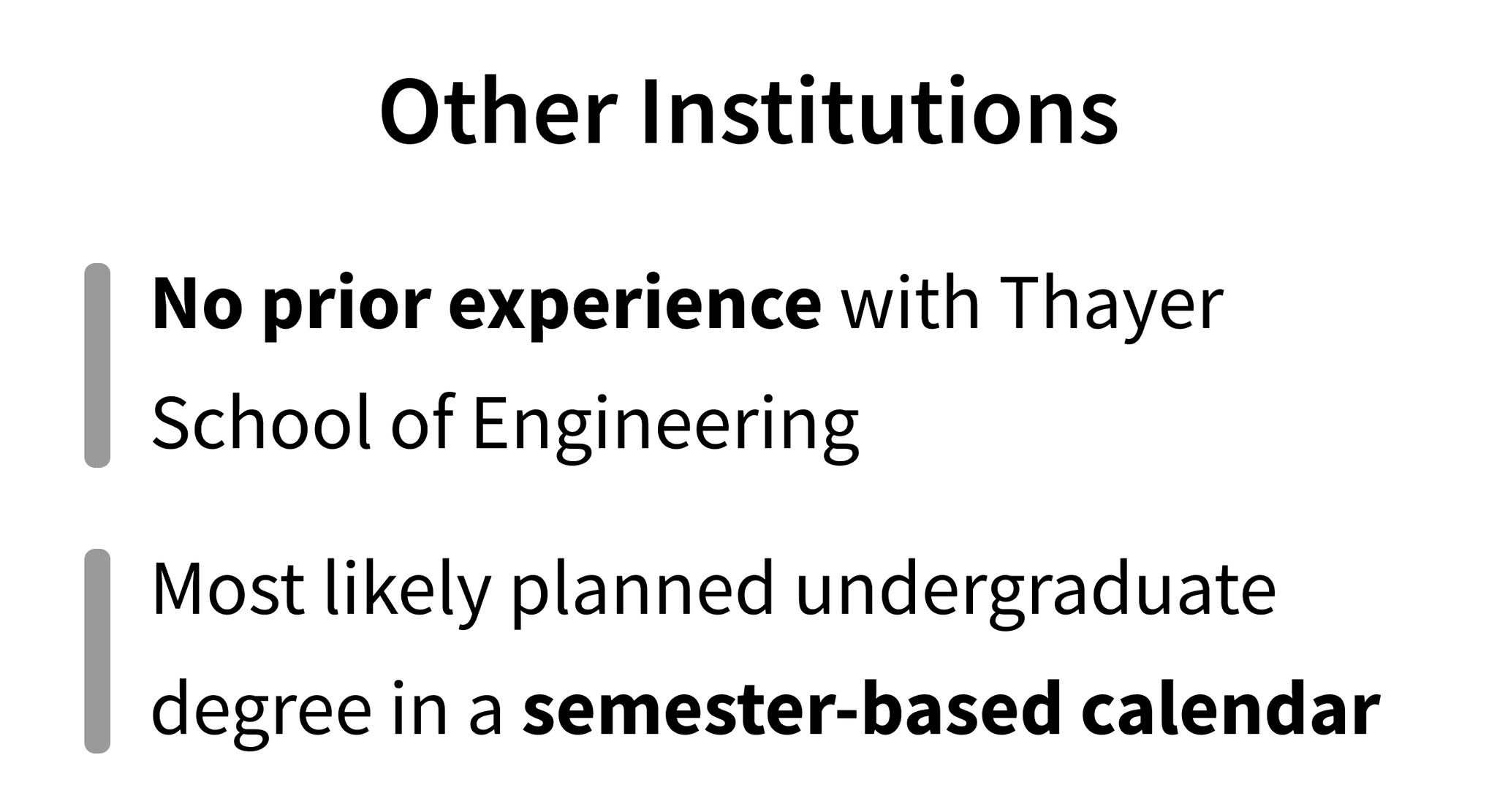
To understand how students actually approach course planning, we conducted in-depth interviews across all six Thayer graduate programs. We spoke with students who completed their bachelor's degree either at Dartmouth or at other institutions.

?
By having students from diverse undergraduate backgrounds walk us through their planning process, we uncovered critical limitations and pain points in Thayer’s existing platform.
Key User Interview Questions
Explain your course planning journey from start to end.
What information is most helpful for finding your intended courses?
What do you find most challenging or frustrating about course planning, and at what point in the process?
What would make course planning a better experience for you?
How fixed is your course plan, and what is the process like when you need to make changes?
RESEARCH
Empathy Maps, User Journeys
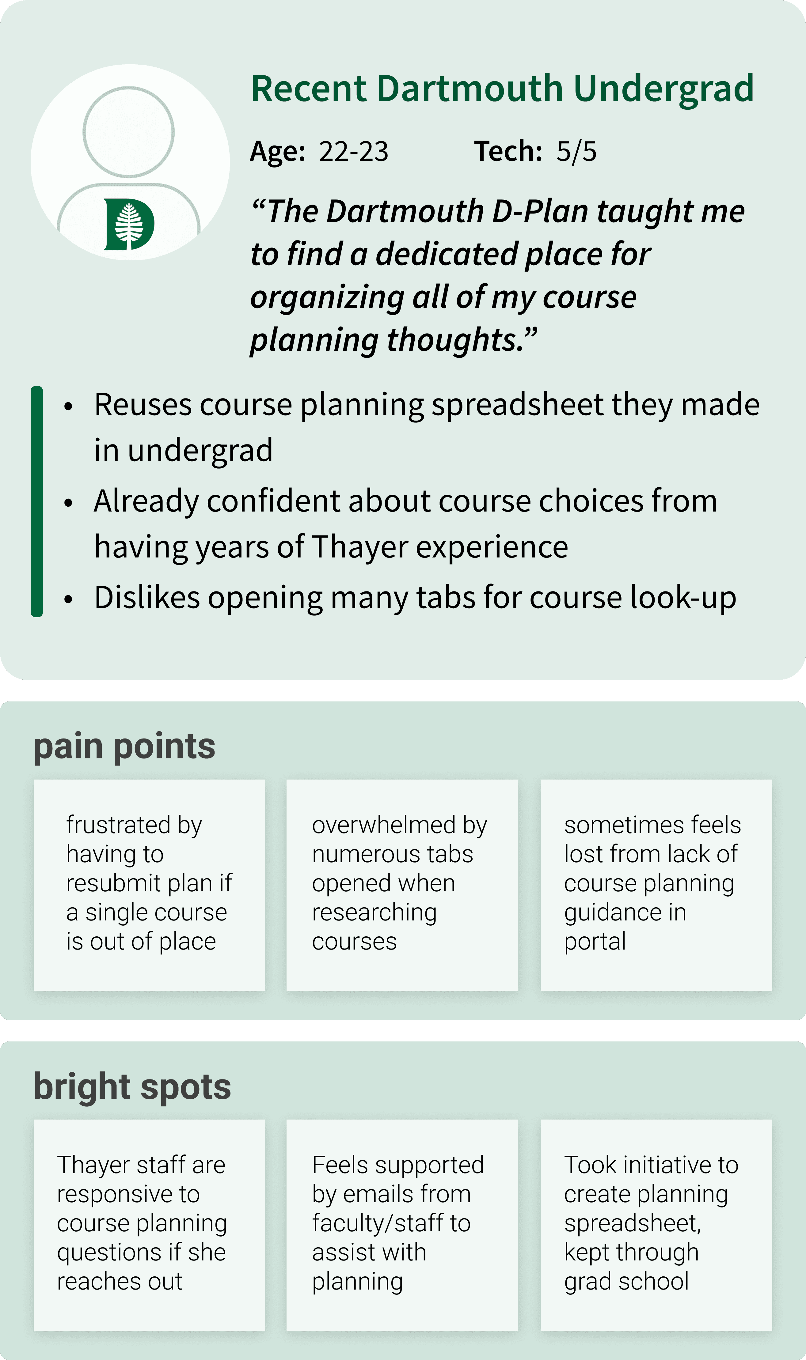
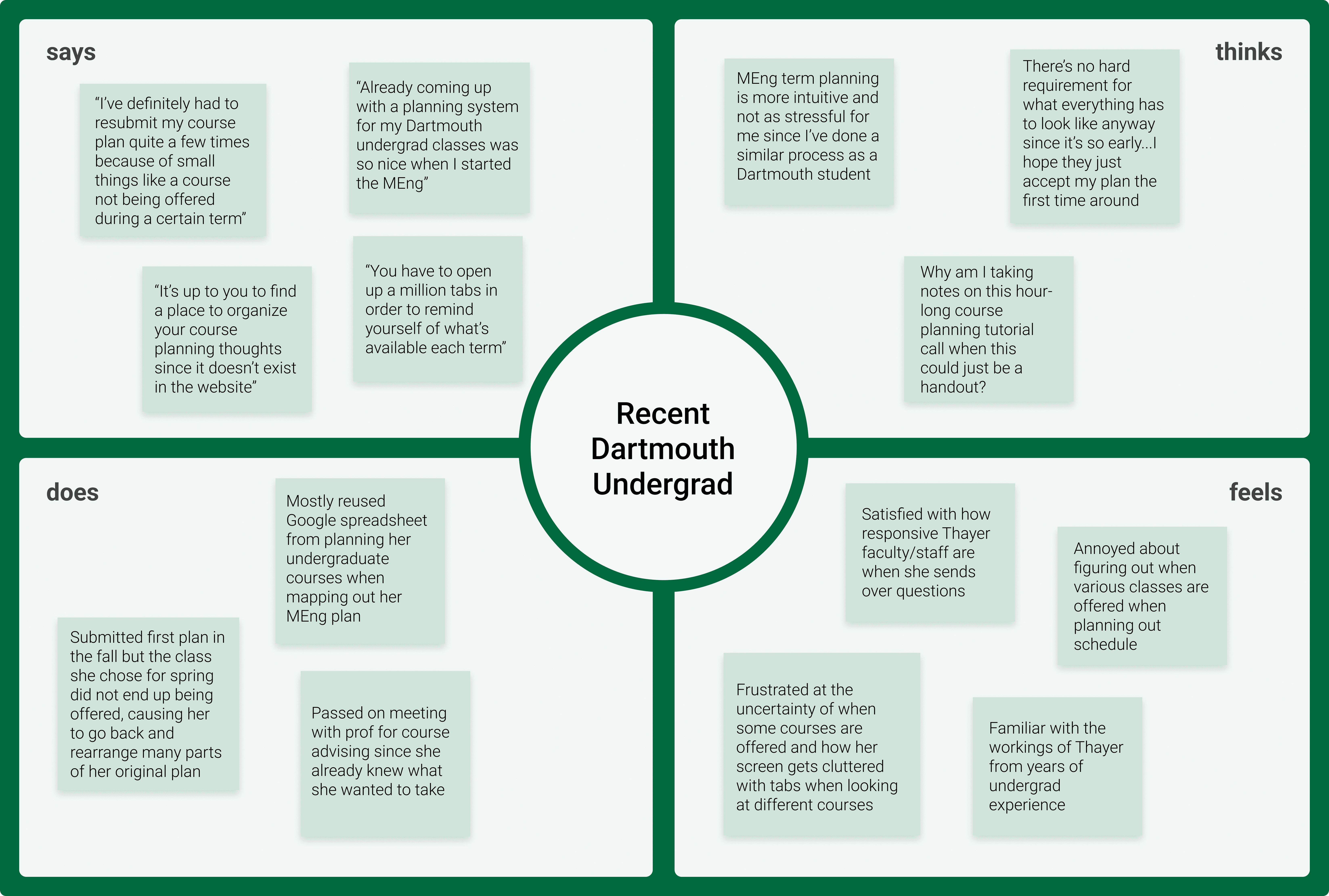
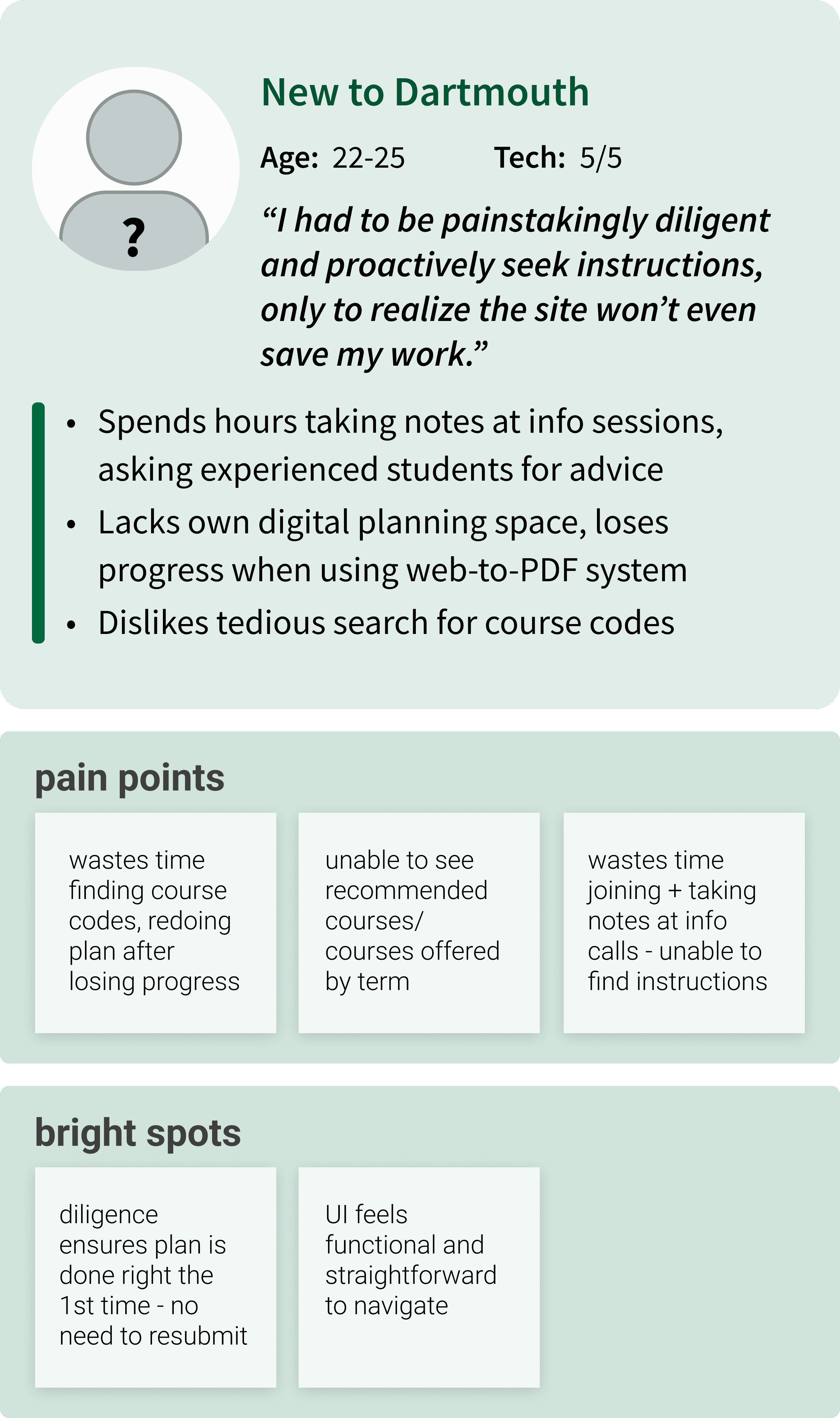
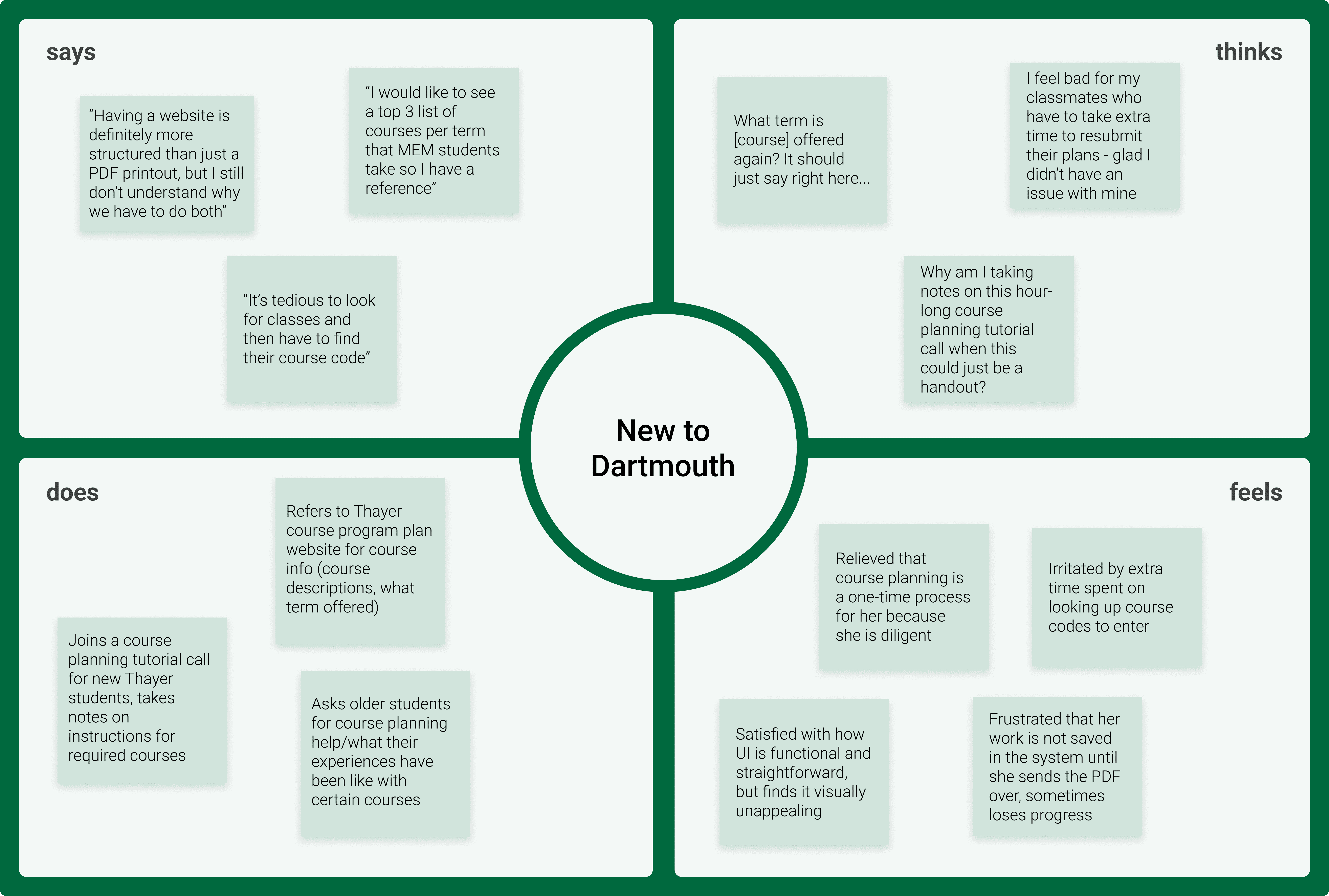
From our interviews, we created empathy maps and user personas for the two main undergraduate backgrounds. This step helped us more closely understand and empathize with our target user perspectives.
Recent Dartmouth Undergrad
New to Dartmouth
DEFINE
Needs, Pain Points
We distilled our findings into major pain points, which mainly stemmed from the platform’s lack of built-in tools and resources.
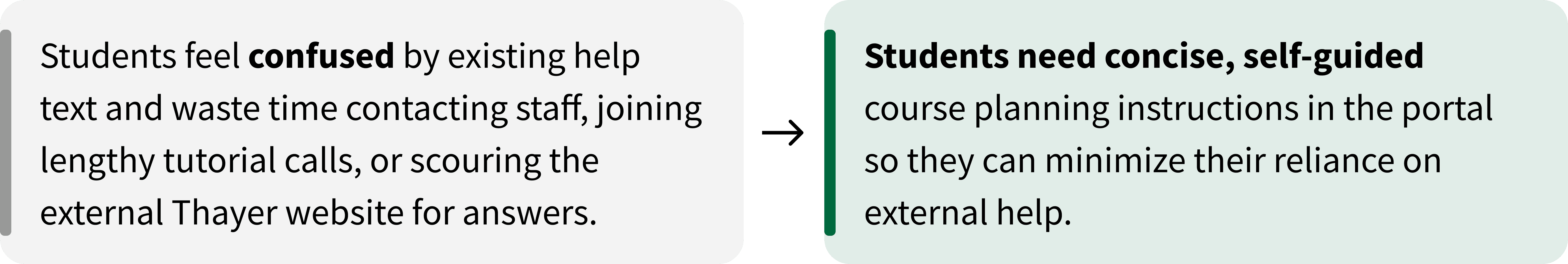
Help text is dense and unclear
Finding, adding and submitting courses is inefficient
No error checking
DEFINE
HMW Statement
How might we help Thayer students streamline their course planning process so they can make confident and efficient decisions?
IDEATE
Goals
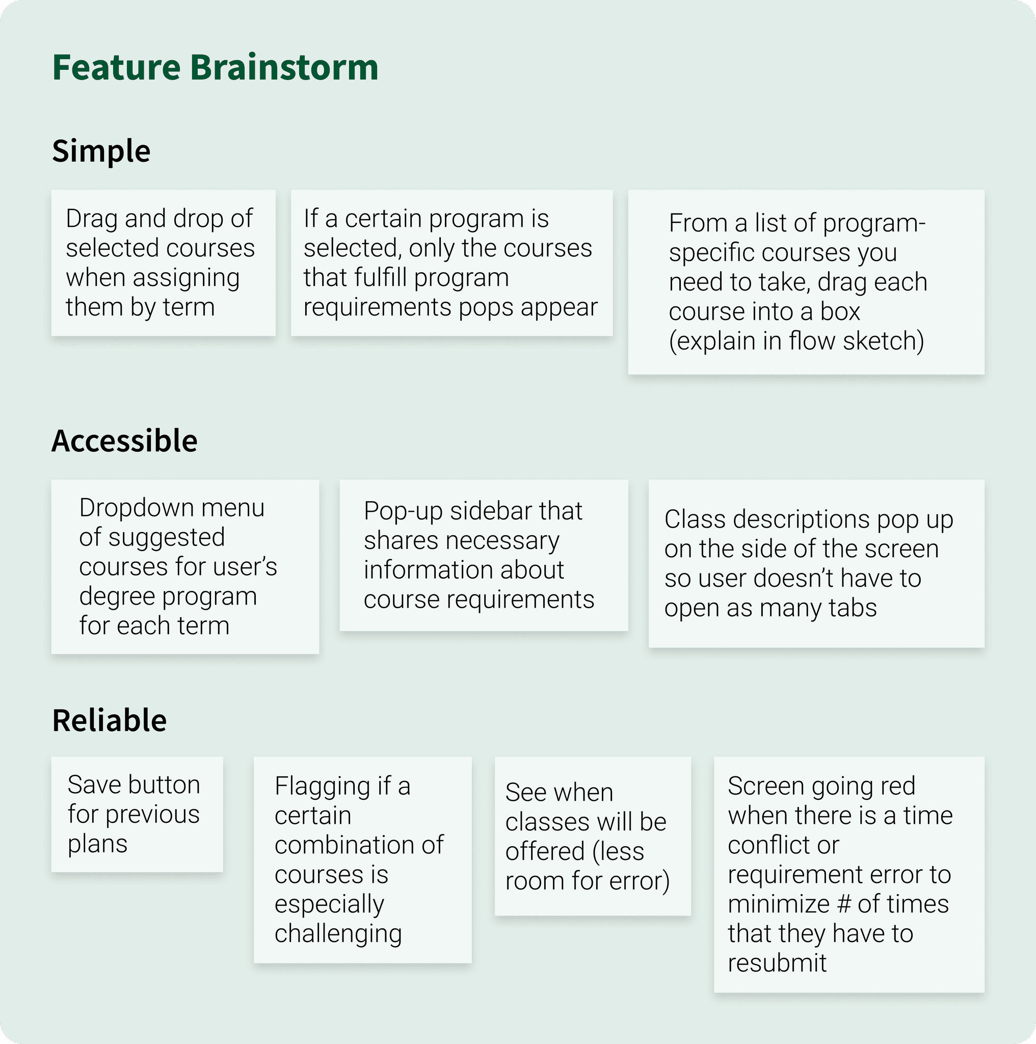
Simple

Accessible

Reliable

IDEATE
Brainstorm
With our product goals in mind, we rapidly ideated then narrowed concepts into a focused feature brainstorm.
IDEATE
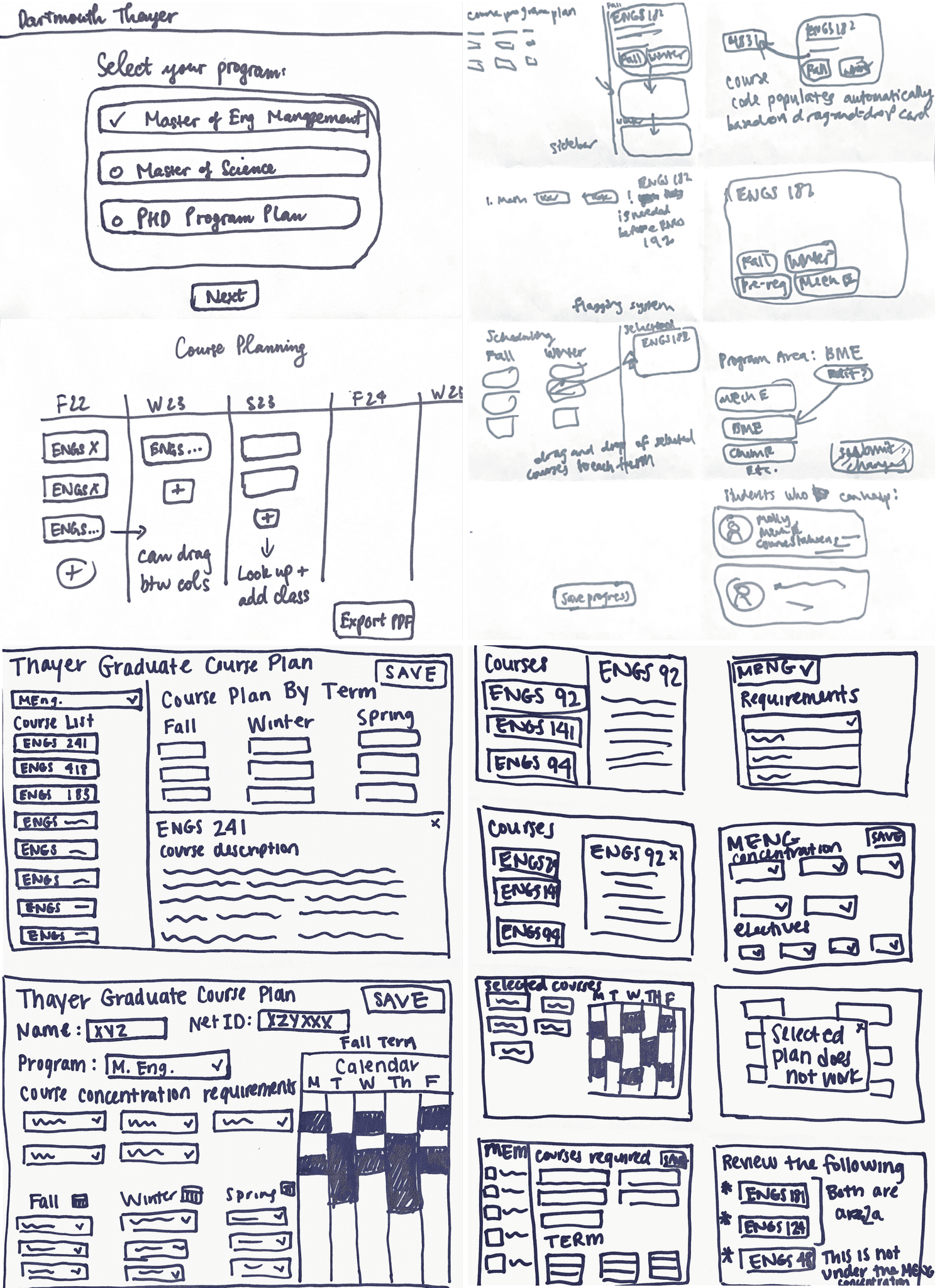
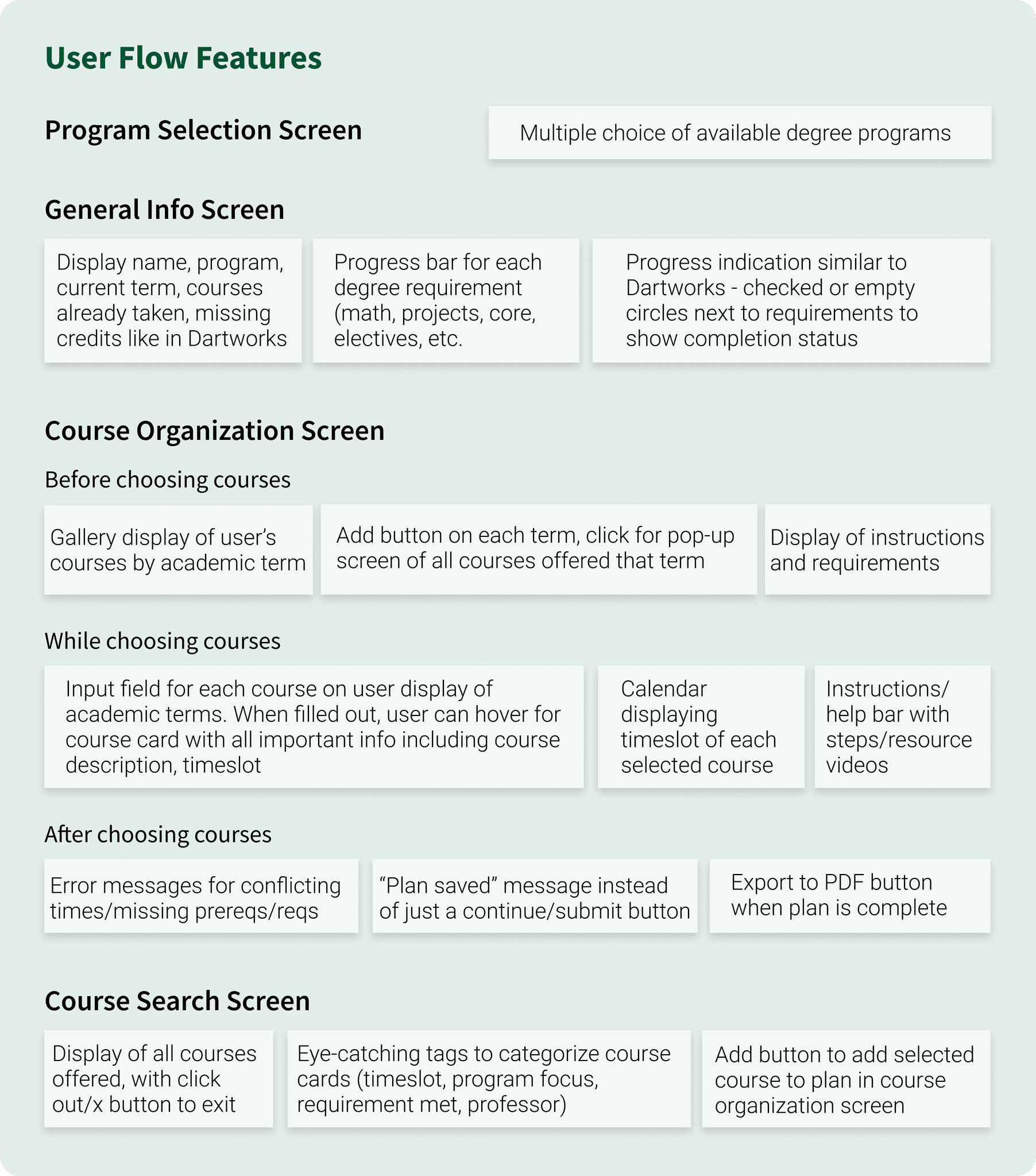
Flow Sketches
With just 10 weeks, we needed to move quickly. We aligned priorities and flow steps with our client, then brainstormed an initial list of features while sketching early flows to visualize these ideas.
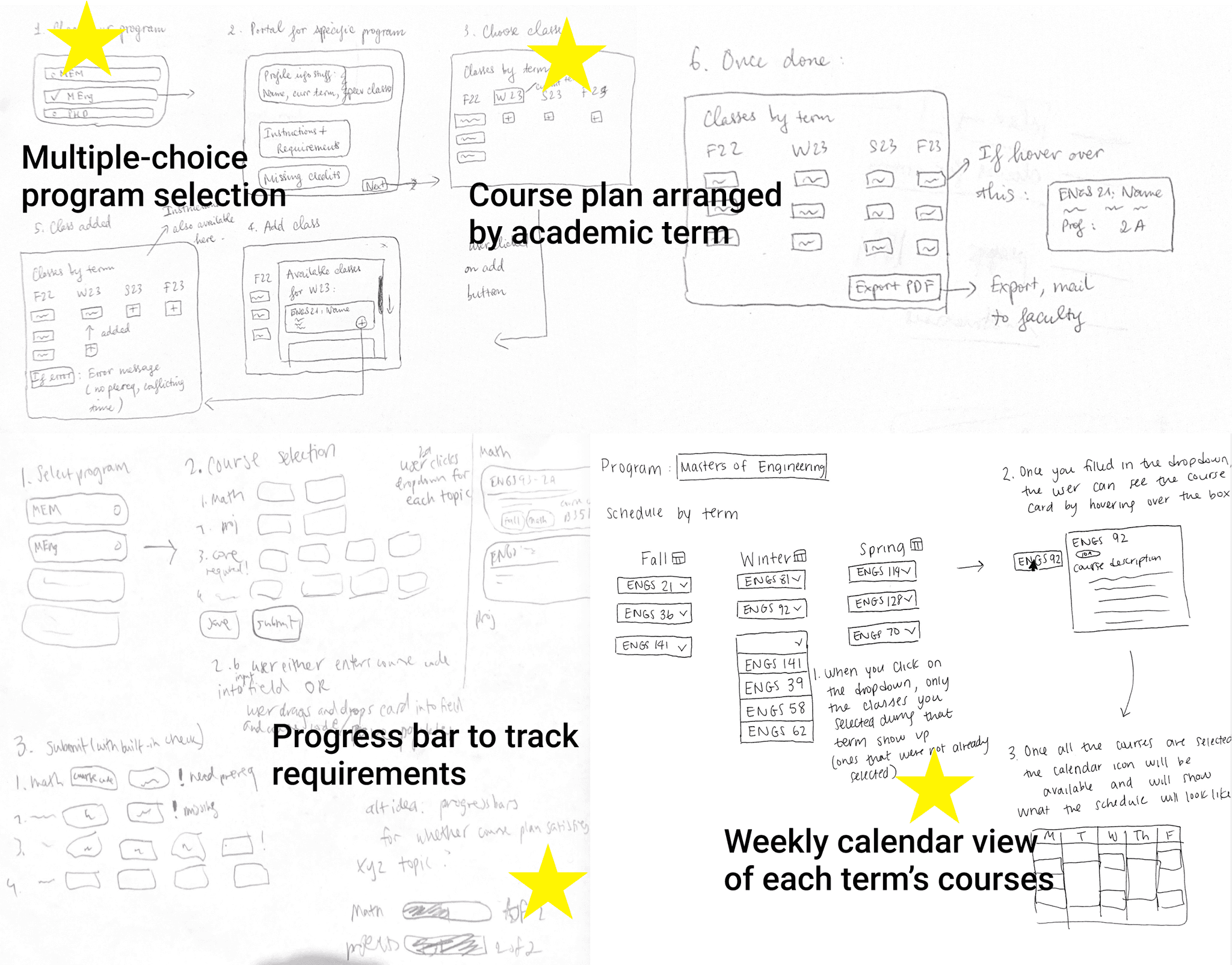
To balance user needs with feasibility, we consulted with our developers to scope technical constraints and worked with our project manager to star features that delivered the most value while fitting within sprint timelines.
IDEATE
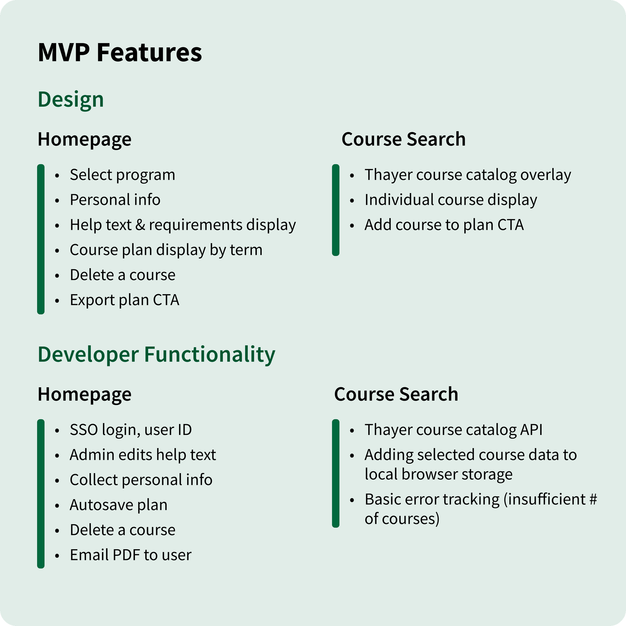
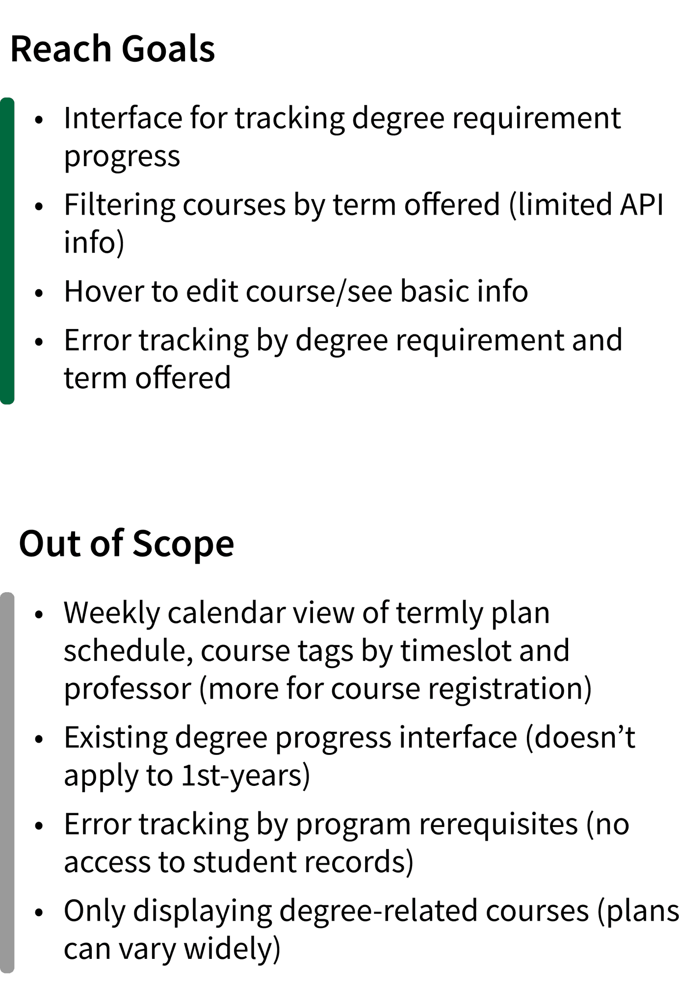
MVP Features
With our PM, we created a feature specification document that mapped user insights against functionality limits. This enabled us to distinguish MVP essentials from reach goals and out-of-scope ideas.
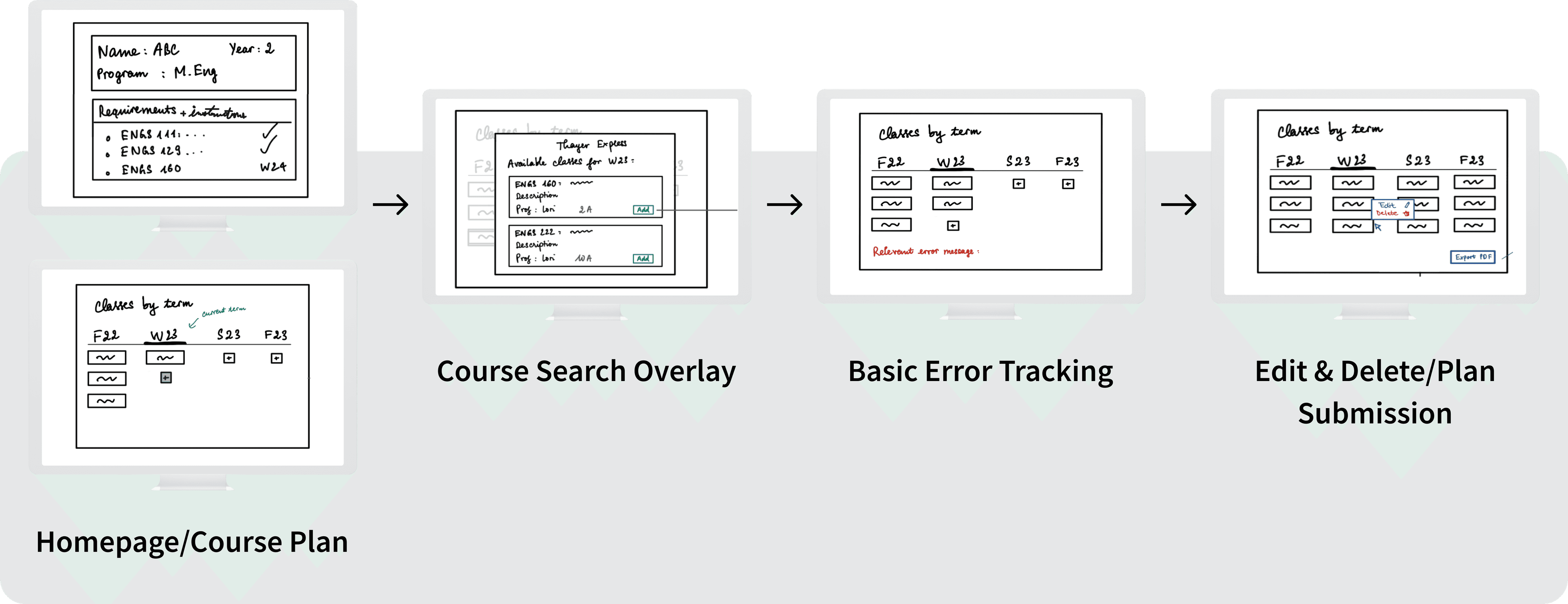
MVP-Focused Flow Sketches
Prioritizing features helped us refine our user flow sketches around MVP essentials. This flow became the blueprint for our first Figma designs.
PROTOTYPE & TEST
Lo-Fi Wireframes
Breaking Down Complex Instructions
One key design goal was making help text digestible and reliable so students did not have to sift through scattered sources. With lo-fi wireframes, we quickly explored ways to present degree-specific guidelines in a clear, approachable format.
Version 1 was a homepage toggle dropdown of full instructions so students could see all guidance upfront, then collapse it to reduce clutter when ready.
After our first DALI critique and client feedback, we pivoted to Version 2: a cleaner toggle carousel of instruction cards with dot indicators.
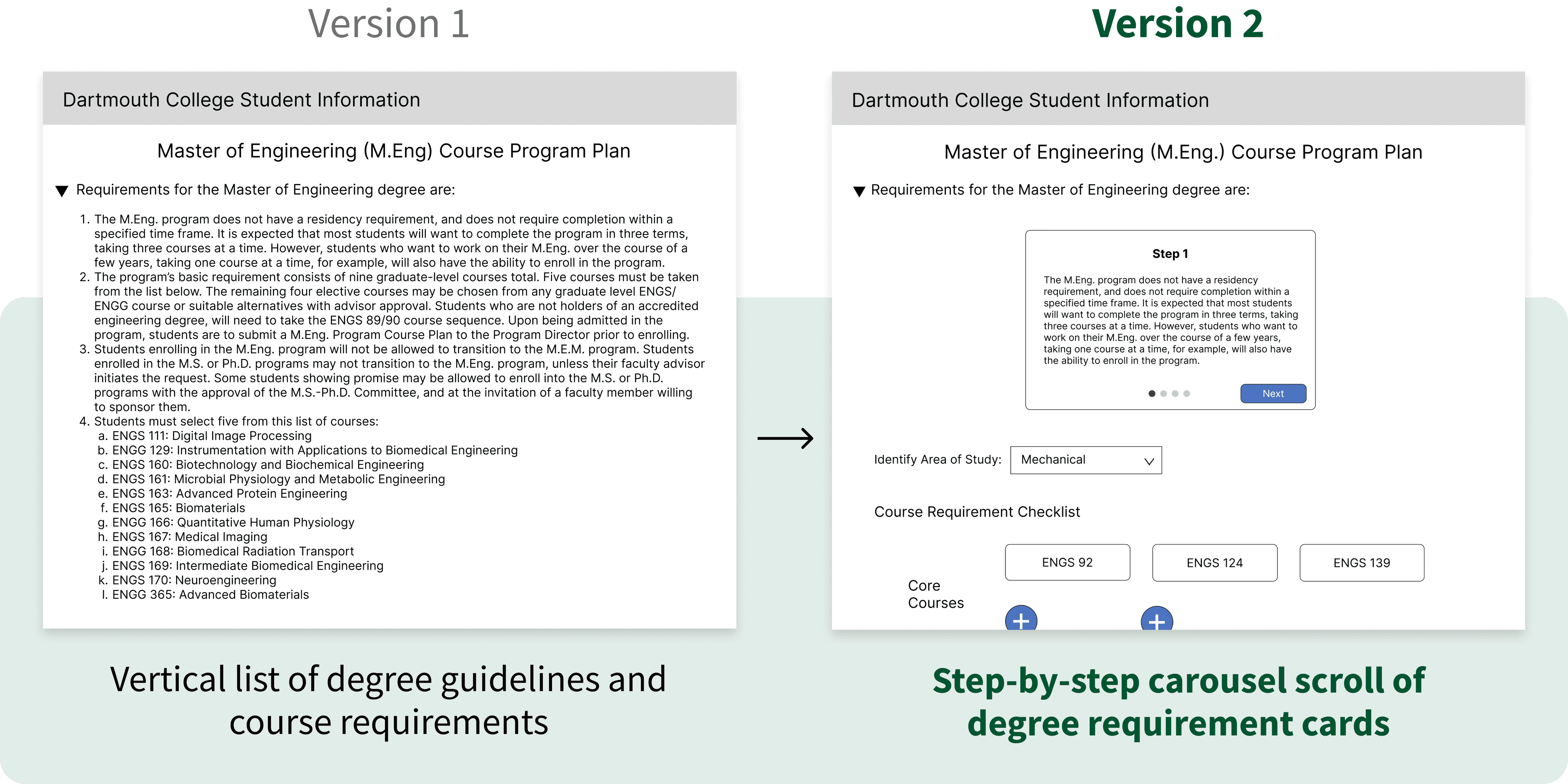
Version 2 conserved vertical space and kept users aware of their progress without overwhelming them with text.
We later hyperlinked supplementary course information, keeping the main instructions view streamlined while giving students access to details when needed.
Organizing Course Catalog Navigation
When wireframing the course catalog overlay where users search for and add courses, I learned from developers that filtering by term was not feasible.
To avoid an overwhelming list, I explored alternative structures and shifted to categorizing courses by core vs. elective requirement, so students could quickly find options relevant to their needs without endless scrolling.
I presented two iterations at our first design critique and to users.
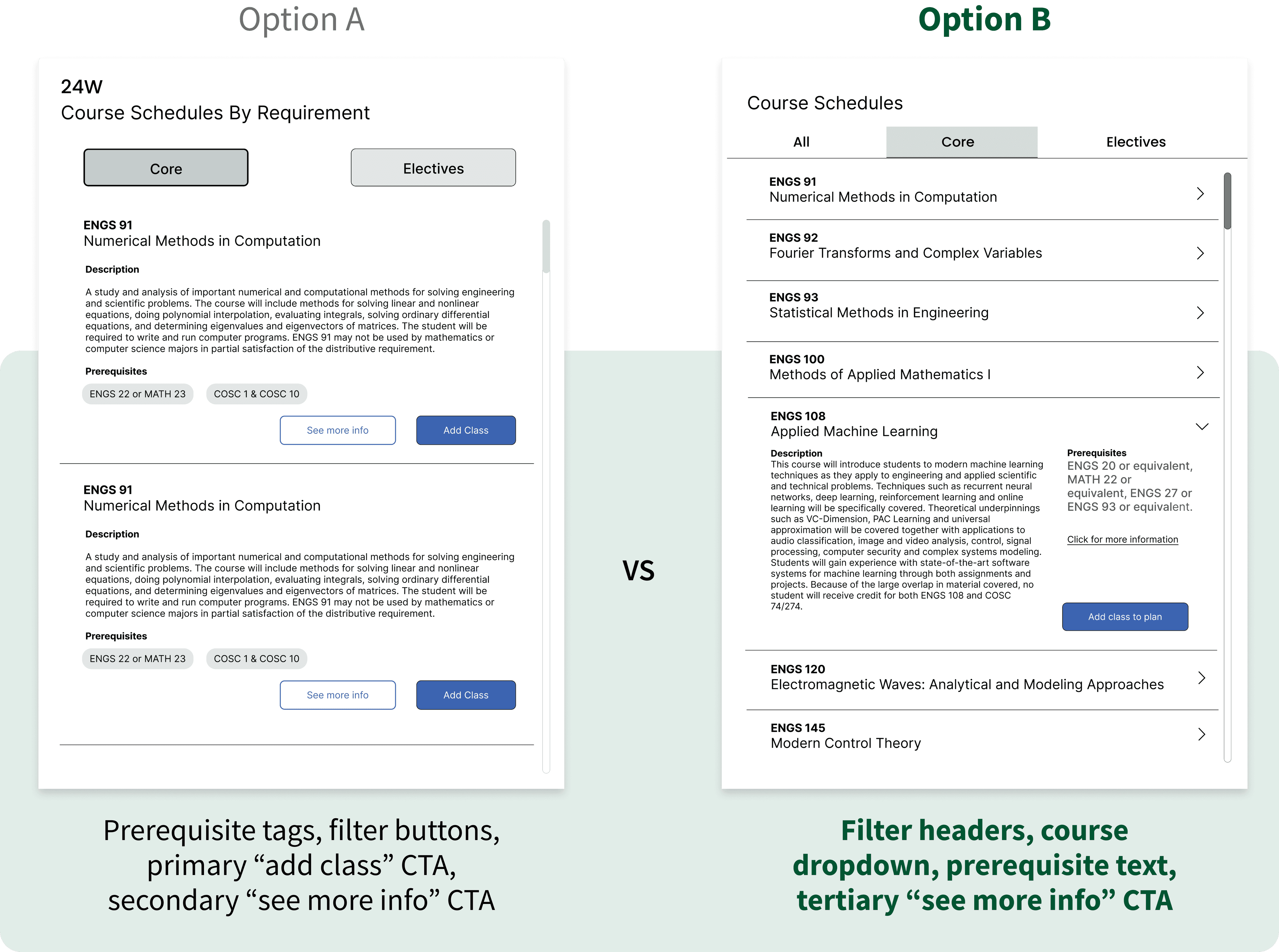
Option A was more unclear. Confused by the Core and Elective filter buttons, students assumed that prerequisite tags were the clickable filters instead.
Option B resonated more with users: intuitive filters, collapsible course dropdowns, and prerequisite details that did not compete with the primary CTA button. These distinctions reduced decision paralysis, helping students feel more in control as they searched for and added courses.
Tracking Degree Progress
Before removing the need for students to manually enter course codes twice, we first tested alternative ways to show progress.
My co-designer created Option A: as users enter course codes by academic quarter, the courses auto-populate in a requirements checklist up top.
I created Option B: progress bars show how courses fulfill each requirement, with the academic quarter display up top to encourage students to add courses first.
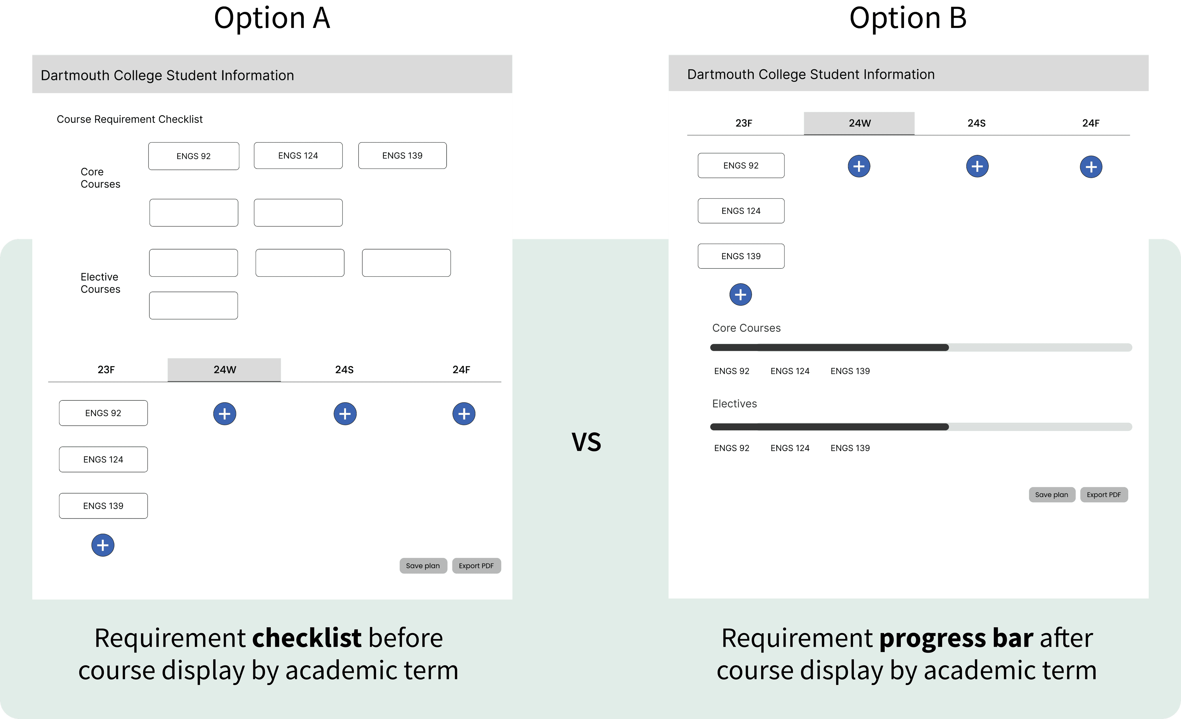
Users found Option B’s progress tracking below the quarter display easier to follow, but thought multiple progress bars were redundant and cluttered. Many preferred the Option A checklist's clearer organization.
In response, we explored how to merge the progress bar’s visual clarity with the checklist’s structured format to align with user preferences.
PROTOTYPE & TEST
Style Guide
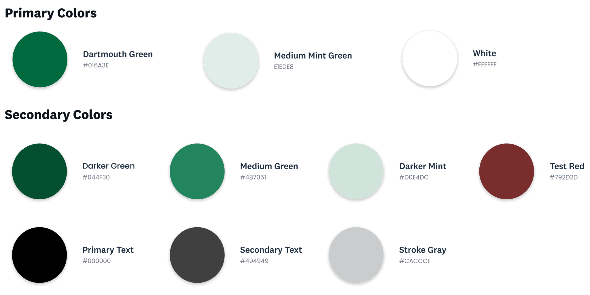
We adapted Dartmouth’s existing style guide, using red only for error states to maintain a calm, focused visual experience.
PROTOTYPE & TEST
Hi-Fidelity Prototype
Let's help users feel confident about seamlessly planning their courses
Another DALI design critique and user feedback helped us refine our wireframes into high-fidelity mockups. We distilled early iterations into a more intuitive, streamlined course planning flow that met technical constraints and addressed important edge cases.
Simplifying and Personalizing Course Search Overlay
Continued user research exposed further course planning complexities. Overlapping core and elective requirements across five Thayer programs give each student a unique path, defying one-size-fits-all scheduling.
This underscored the need for a course search experience that adapts to individual goals while maintaining clarity.
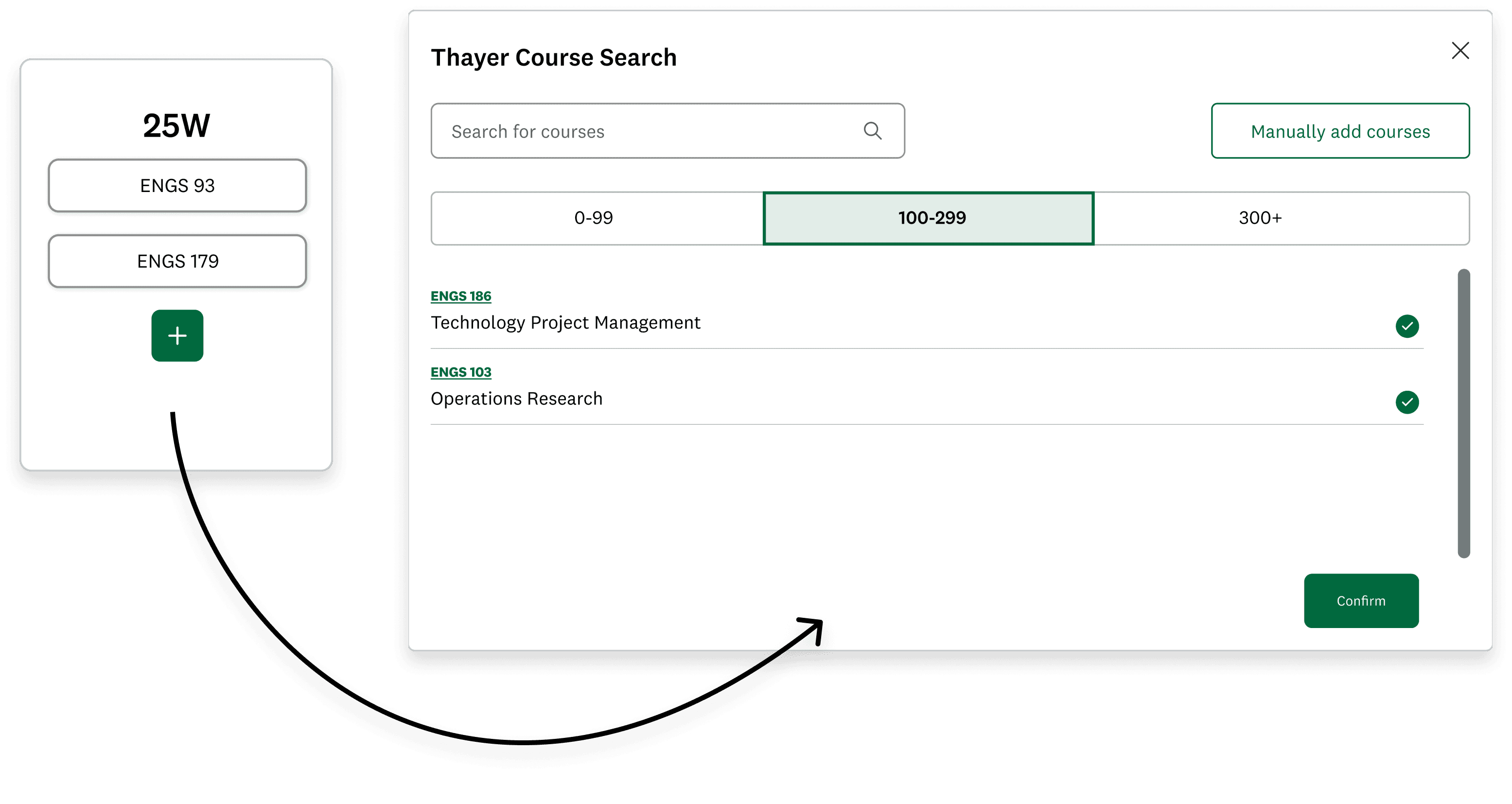
We reorganized catalog filters by course level and introduced pill-style program requirements, prompting users to tag each course before adding to their plan.
When our developers confirmed that only course codes and titles were available in their dataset, we adapted by linking titles to the external web catalog so students could explore more as needed.
Without course descriptions to reveal, dropdown chevrons no longer served a purpose. We replaced them with quick-select buttons to make adding courses more swift and actionable.
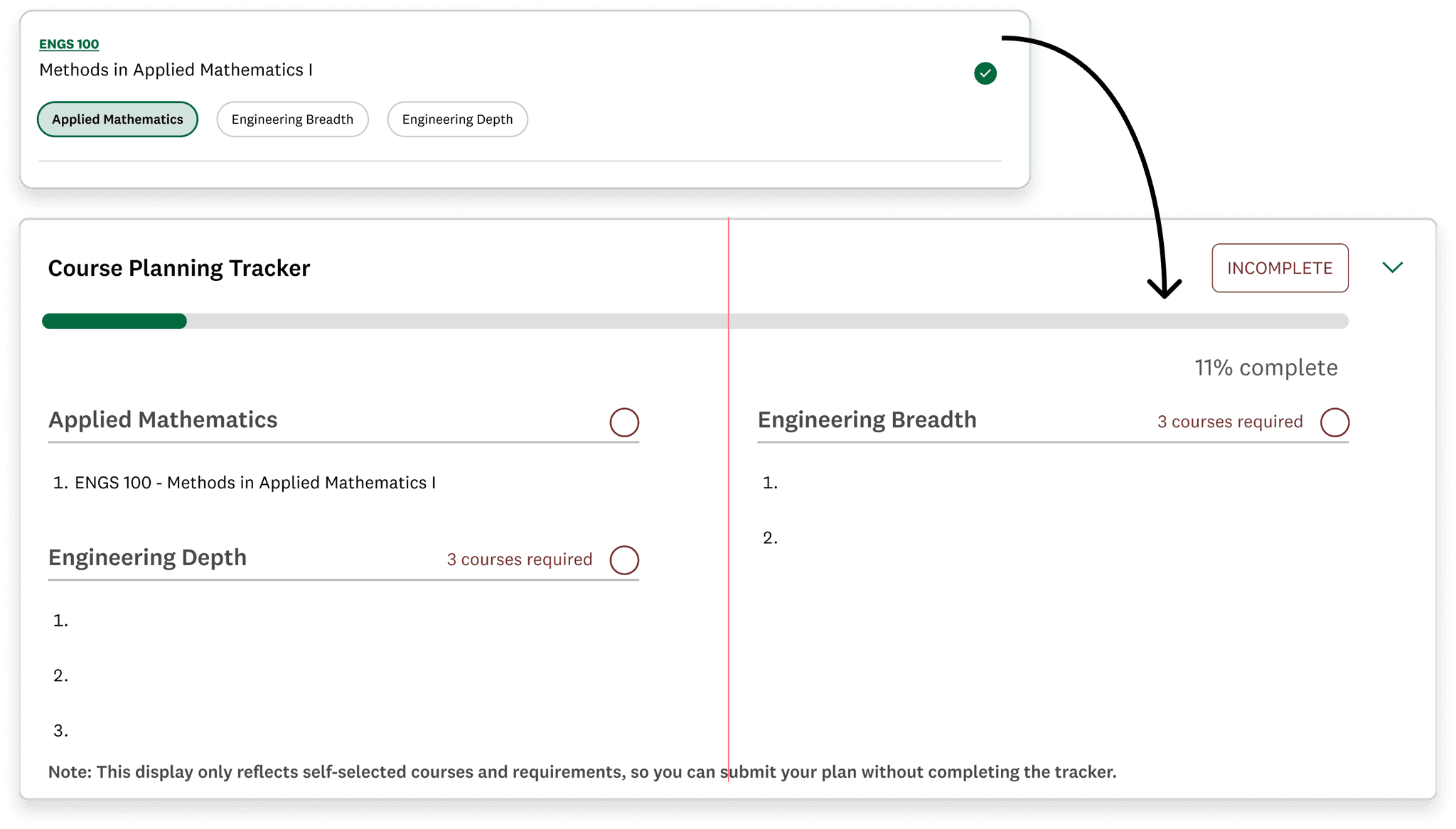
Combining Requirements Checklist With Progress Bar
We merged the checklist and progress bar into a collapsible module that visualizes real-time course planning progress, displaying overall updates in a single bar and populating courses under selected requirements.
Once users add courses that fulfill all degree requirements, the “Download PDF” button activates. Clicking it opens a PDF of their final plan with submission instructions, completing the course planning flow.
Supporting Manual Entry for Unlisted Courses
Students need to manually enter interdisciplinary electives that fall outside the engineering school catalog.
I led the manual add overlay design and introduced radio buttons to indicate that each course fulfills only one requirement.
Although manual add was for edge cases, it revealed an opportunity for our team to discuss whether radio buttons conveyed single-choice selection more clearly than the main overlay’s pill design.
To maintain consistency and confirm user preferences, we tested both interactions in our first round of usability sessions.
PROTOTYPE & TEST
Usability Testing
In-person usability tests with four Thayer graduate students and DALI student users uncovered friction points in navigation and task flow, guiding us to make the following prototype updates:
Reformatting Degree Requirement Selection
New Thayer students found the pill selection of degree requirements misleading and frustrating, as they assumed they could choose multiple requirements for each course.
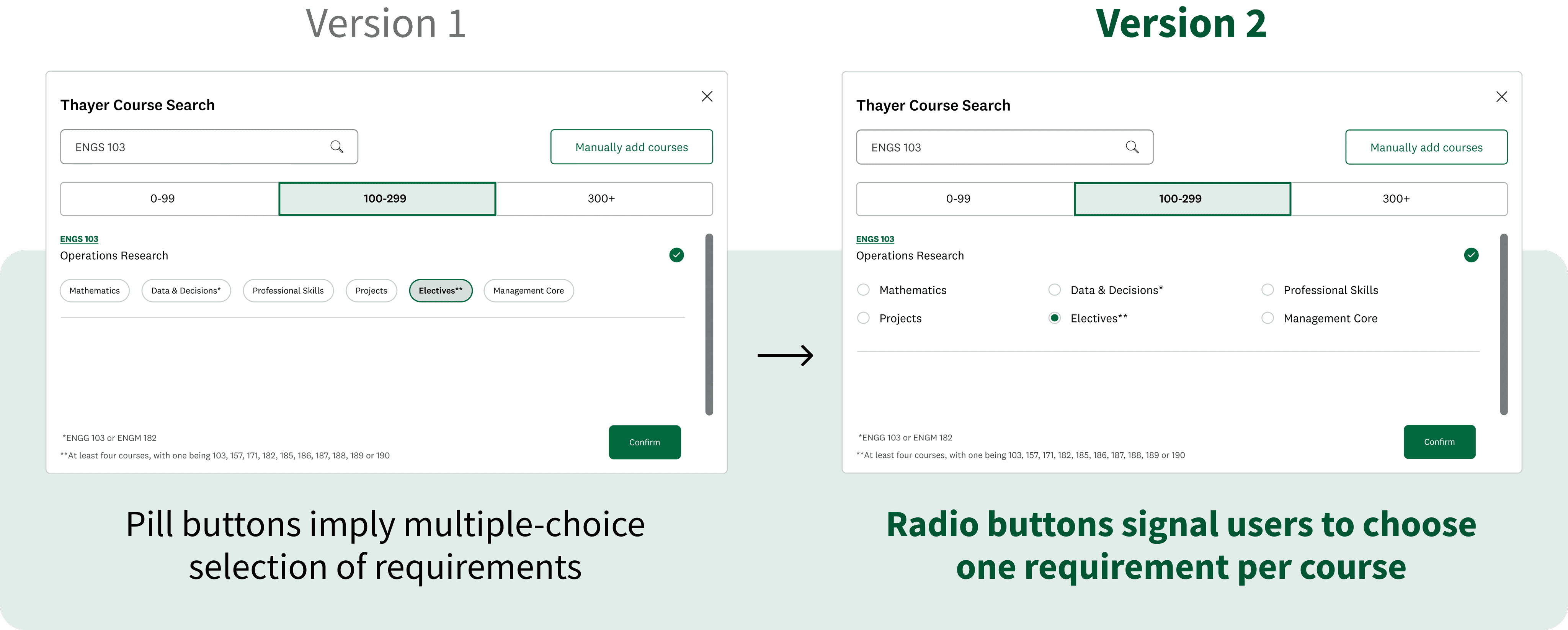
Users unanimously preferred radio buttons, which clearly signaled how each course is assigned a single requirement—a detail that first-year graduate students especially appreciated.
Clarifying Edit and Delete Flow
Most users found our hover menu clunky and spatially confusing, often deleting the wrong course.
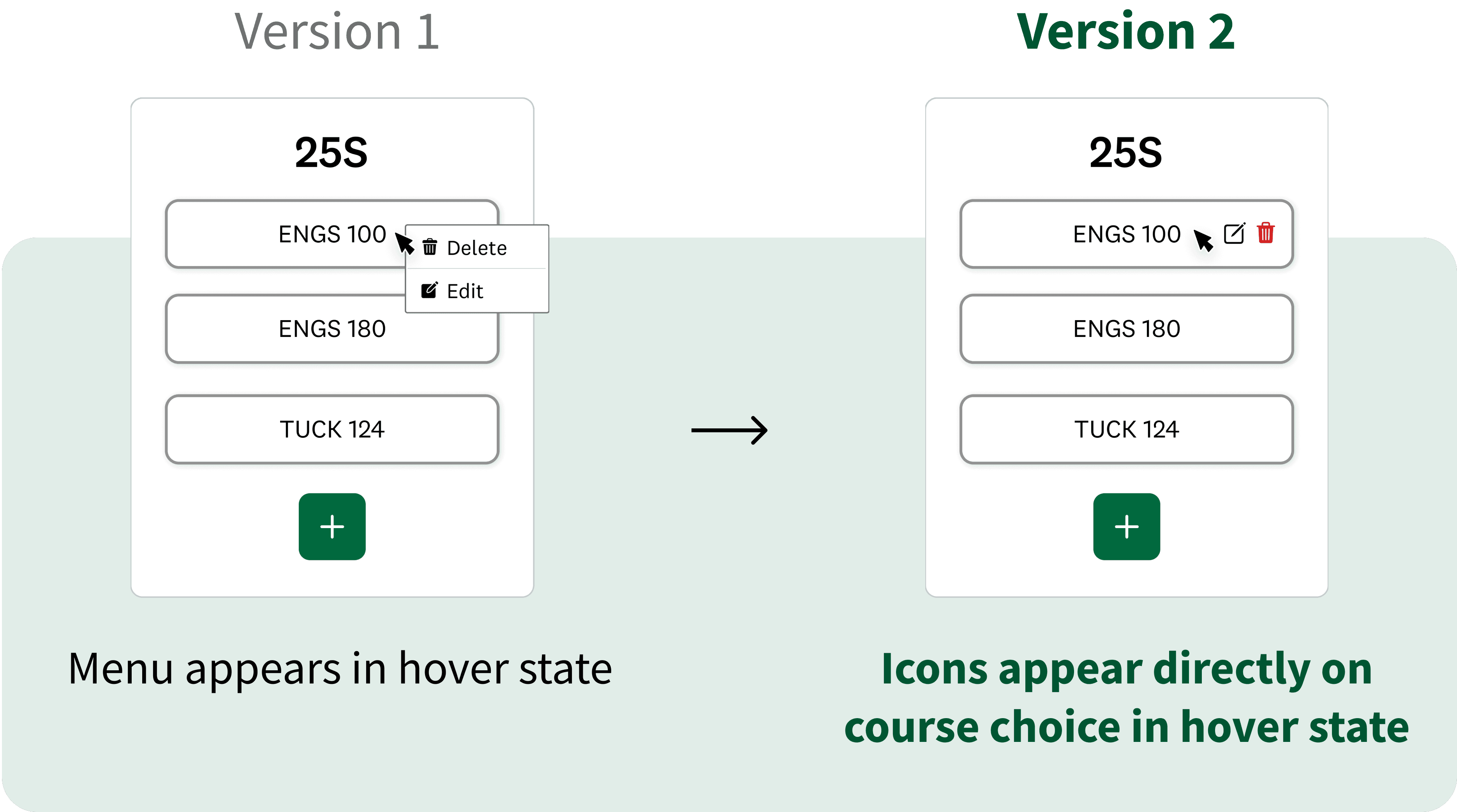
Observing that users universally understood our menu icons, we removed textual labels and consolidated the hover interaction to show “Edit” and “Delete” icons directly on each course, clarifying the exact item being modified or removed.
We initially designed a standalone course edit overlay, but users wanted to retain full catalog access when editing. So we updated the edit flow to return users to their work in the original course overlay, preserving context and continuity.
Adding Multiple Courses at Once
Some users disliked having to reopen the course search overlay whenever they added a new course, and suggested a multi-select format to streamline the process.
Towards the end of our sprint, we focused on higher-priority features and only prototyped an early version of the multi-select idea. In future iterations, we hope to expand on the multi-select feature with a dedicated section for selected courses and a secondary CTA that prompts continued searching.
PROTOTYPE & TEST
Final Designs
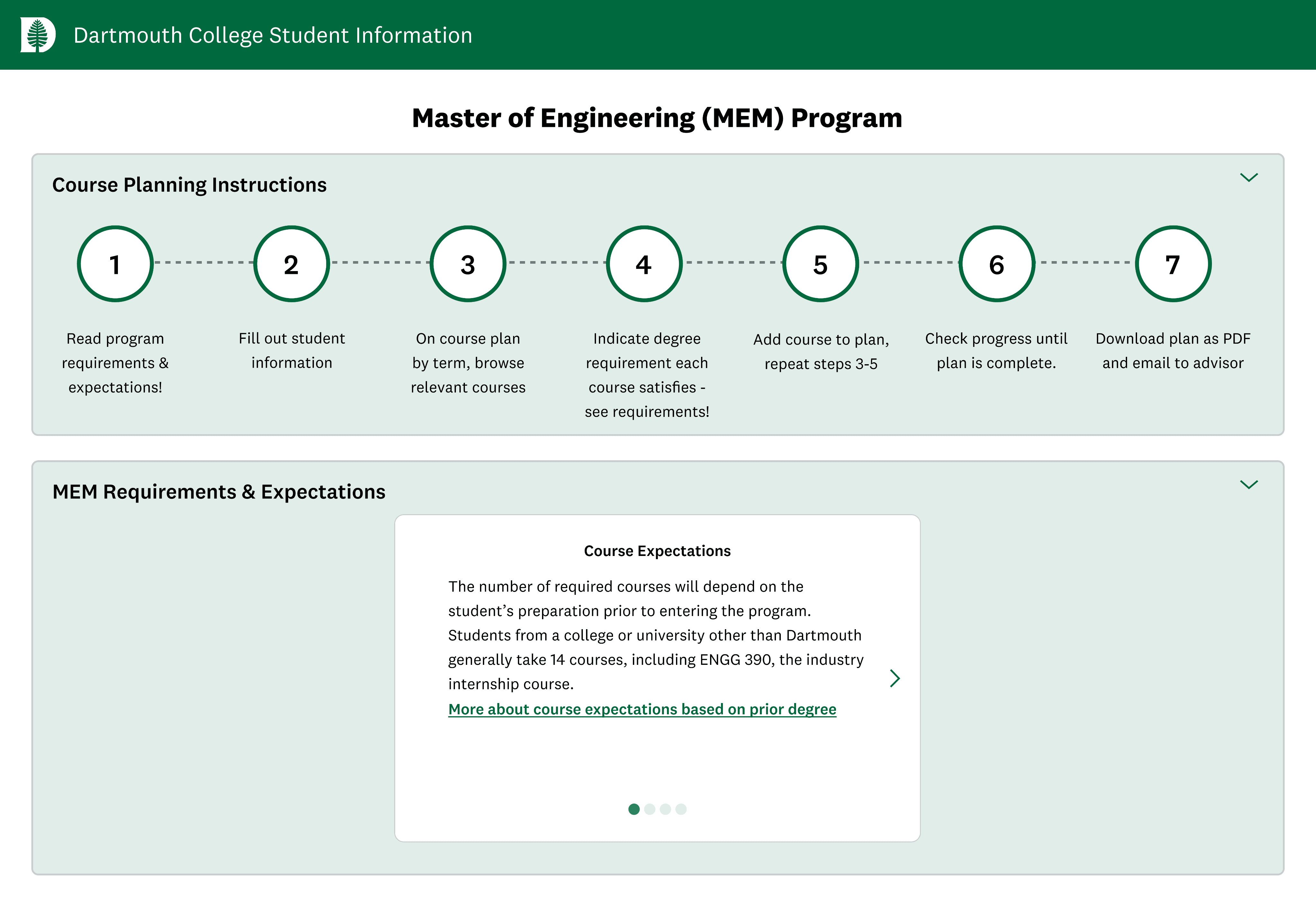
Clear Instructions
A collapsible dropdown of steps guides new students through how to use the platform. Another dropdown reveals a carousel of key degree requirements and resources to help users identify relevant courses.
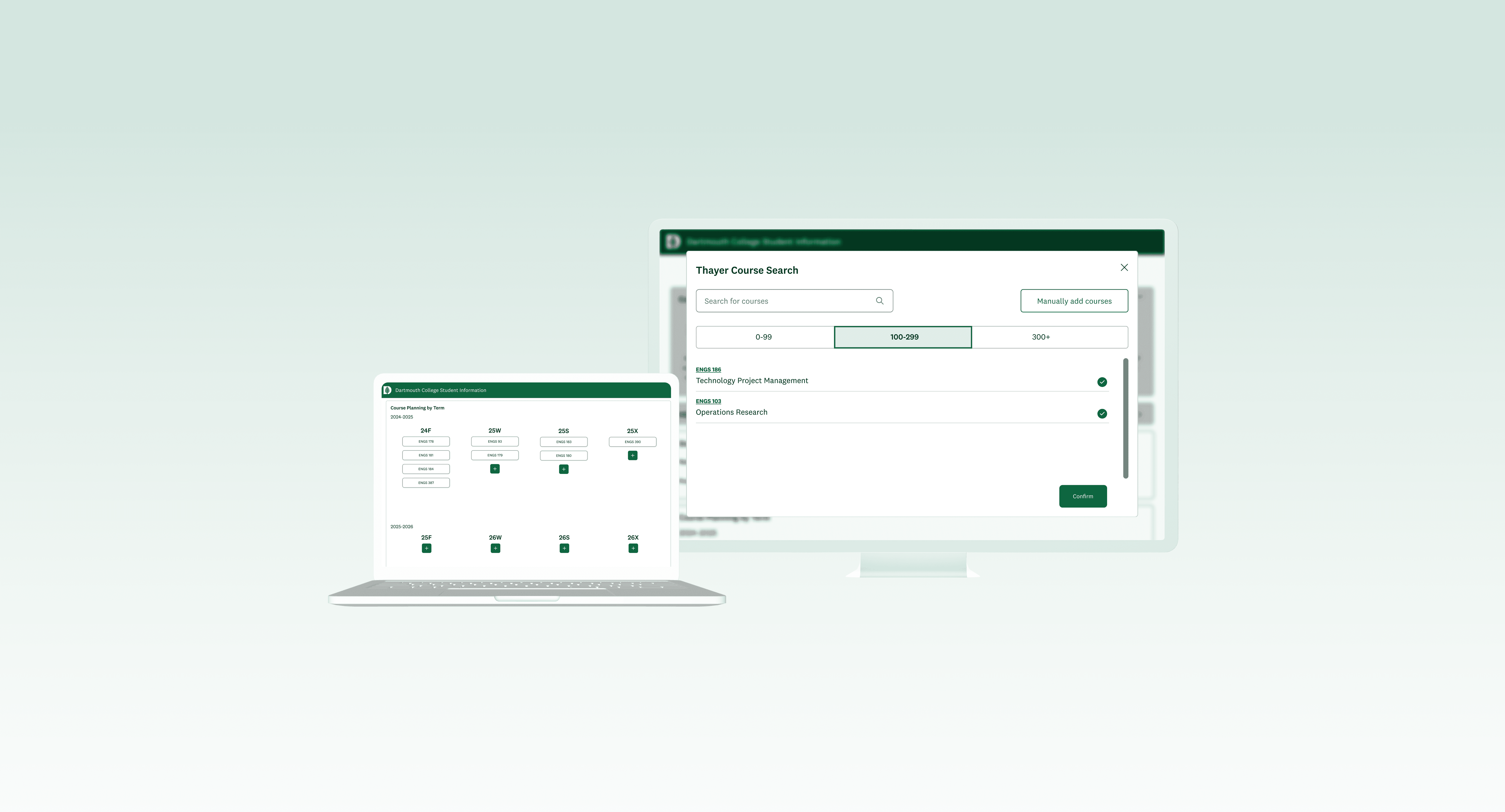
Built-in Course Search
We replaced the manual process of researching courses and typing in codes with a built-in catalog that enables users to quickly add multiple courses at once per academic term.
Track Degree Requirements
When choosing courses, users tag the degree requirement each course fulfills. These selections feed into a progress tracker on the main page, helping users visualize how their choices contribute to their degree and identify any remaining requirements.
REFLECT
Takeaways & Next Steps
This project was both challenging and fulfilling. In 10 weeks we redesigned the Thayer course planning portal from the ground up, working closely with our developers and PM to align the product with user needs and technical constraints. The result is an efficient, intuitive tool that enables graduate students of any experience level to confidently plan their courses.
Here are 3 key takeaways we learned from this sprint.
Our Dartmouth ITC clients responded enthusiastically to the final product and plan to deploy the new site in fall 2025. Next, we will apply feedback from expanded usability testing to further refine the course planning flow.
Potential future improvements include integrating the tool with program advising and adding filters for academic term, time, and instructor.
